The color of your logo is, in many ways, even more important than the design itself. Why? Well, while people register the shape unless it’s something really basic, they won’t remember it. They will, however, remember the color of the logo.
If you don’t believe us, just test it out. Look at a dozen or so logos and close the tab. Then, try to remember the color of each logo. Now, do the same, but try to describe the image on the logo. Chances are that you’ll get it right more times during the first test.
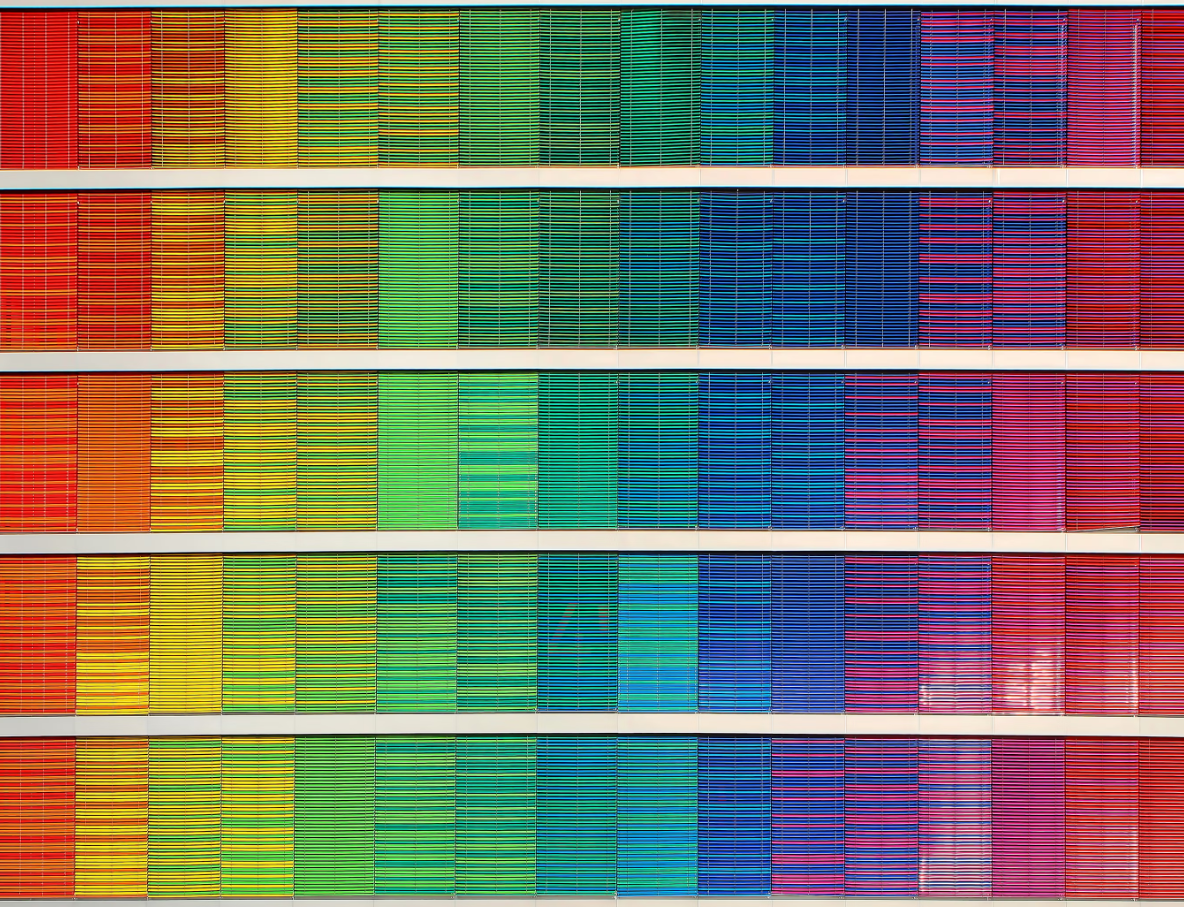
Still, this puts you under even more pressure when picking a color. Here are the top seven principles you should follow when picking a color for your logo.
Try out different ideas
The first thing you need to understand is that colors and images sometimes appear differently in our minds than they do in real life. Unless you’re a design professional, you won’t be able to envision the way all the colors blend or how a certain color looks on a specific background. Fortunately, there’s a way to avert this.
You can use AI logo makers to create these logos so that you can evaluate them based on real-life examples, not a vague concept in your mind.
The best part is that with the help of an AI logo maker, you can get at least an idea of what you’re getting into. You see, there are dozens of AI logo makers out there that will show you the realization of your concept in a matter of seconds. This way, you don’t have to rely on your own power of imagination. Instead, you can see what the end product looks like and decide whether this is the direction that you want to go in.
It’s important that you keep in mind that these AI logo makers are quite useful even if you don’t want a logo made by an AI. Just having an AI-generated logo to show to your actual logo designer could help clear out so many misunderstandings and facilitate the process.
Study the industry
The next thing you want to do is study the industry itself.
For instance, if you’re in the fast food industry, you’ll notice that everyone is using red for their logo and brand colors. So, you might feel like it’s a good idea to go with something different, something unique.
The problem is that this means that you misunderstand why all of these brands are actually choosing red (and yellow). You might just assume that it’s just a lack of originality on their part. In reality, while red is a color that inspires passion and impulsiveness, it’s also a color that increases one’s appetite.
Aside from this, it’s a bright color that instinctually captures one’s attention. This means that a person passing by your fast-food joint will notice it immediately and might stop by. As we’ve already said, it inspires impulsiveness, and even in this age of apps, a lot of people will come in person instead of placing an order online.
At the same time, you don’t want to be too similar to your competitors. So, what you should do instead is pick a nuance that they’re not using. Sure, red is great, but what kind of red? There’s a huge difference between cognac and maroon, and you need to understand it.
The personality of your brand
You can say so much about your brand through the color selection. For instance, if your brand is eco-friendly, you could always go with something green. This immediately sends a message that you’re eco-friendly and that you put a lot of emphasis on the preservation of the environment.
Even here, you have a lot of different hues to pick from. For instance, mint works best for its calming and tranquil effect, whereas lime green tends to be more strongly associated with nature. Depending on the nature of your business, your products, etc., you might find one to be better than the other.
You can also reflect on your pricing strategy and the USP (unique selling proposition) of your brand. For instance, there are some colors that work amazingly with luxury brands. We’re talking about various combinations of gold, black, and regal purple. On the other hand, if your brand is marketed as a budget brand, this won’t work as well.
You can also leverage the color to usher in your marketing campaign and build long-term relationships with your audience. Brown, for instance, guarantees loyalty, trust, maturity, and strength. In other words, it could even be a boost to your loyalty program.
Check for versatility
Where is your logo going to be placed?
It’s a silly question, right? Everywhere, of course. Well, this could be a bit of a problem since different colors work differently in different environments.
For instance, you want a logo to be placed on your website, but you also want it as a profile picture on all your social media accounts. If you’re developing a mobile app, it should also be a mobile app icon, and you have no idea what kind of color palettes your audience has as their background.
If you plan to go with a bit of old-school marketing, you need to envision all the backgrounds, materials, and surfaces that might feature your logo. In other words, you could have it on cups, billboards, flyers, T-shirts, umbrellas, car doors, and more. All of this needs to be taken into consideration.
Naturally, you won’t be able to account for every single material, but then again, you don’t really have to. Just keep in mind that you should focus on the few most relevant mediums (the ones you’ll use the most).
Focus on avoiding mistakes
Sometimes, you shouldn’t focus too much on getting things right. Why? This often translates into trying to make things perfect, which is completely impossible. Instead, why not focus on trying to avoid some common mistakes while creating a concept that you personally like?
If the concept fits all the above-listed criteria and avoids major mistakes, it’s good enough. After all, a logo is a visual medium, and, as such, it’s something completely subjective. Moreover, a “perfect” logo wouldn’t help you close the sale on your own. It’s just there to be a part of the overall first impression, which, even though a huge issue, isn’t game-changing.
So, one of the things that the majority of bad logos have in common are outdated visuals and mismatched colors. Now, while outdated visuals usually refer to a specific font of the logo, in reality, even an outdated font can be a great hit if you’re aiming for nostalgia. At the same time, mismatched colors will never work.
Once again, we return to the topic of fast-food logos. Yellow and red work great together, and McDonald’s is not the only brand that figured this one out. There are a lot of color combinations that work, but this doesn’t mean that you can just pick the color at random.
Picking the right logo is a necessary first step to great branding
You can’t proceed with branding until you have the basics done right. Brand recognition is impossible without the right visuals, and visuals are heavily dependent on your logo. Picking the right colors will ensure that you leave a lasting first impression, which is a huge advantage over most of your competitors.
