The Oakland Raiders, an iconic force in the NFL, are characterized by their bold Silver and Black colors. These shades do more than mark the team’s visual identity; they encapsulate the Raiders’ formidable essence and the intimidation they bring to the gridiron.
The Silver represents a futuristic, cutting-edge vibe that aligns with the Raiders’ pioneering spirit, while the Black stands for power and intensity, mirroring the team’s fierce competitive nature. Silver and Black blend to symbolize the Raiders’ enduring legacy of strength, determination, and a relentless pursuit of excellence.
| Color | Preview | Hex | RGB | CMYK | Pantone |
|---|---|---|---|---|---|
| Silver | #a5acaf | 166 174 176 | 5 0 0 25 | PMS 429 C | |
| Black | #000000 | 0 0 0 | 70 50 50 100 | PMS Black C |
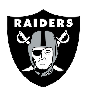
Oakland Raiders Logo
The Oakland Raiders logo is iconic in the realm of American football, symbolizing a legacy of tenacity and success. At the heart of the logo is a pirate or “raider” with a helmet on, set against a shield that carries the team’s name and the dual swords crossing behind. The choice of a pirate image aligns with the Raiders’ image as rebels and fighters, while the shield represents strength and unity. The colors Silver and Black in the logo further emphasize the team’s core colors, reinforcing their brand identity. This logo has remained largely consistent over the years, reflecting the enduring spirit and legacy of the Raiders.
|

|
