Picture yourself diving into a colorful video game world or sitting down to play a well-designed board game. The colors you see aren’t just there to look pretty – they’re actually working behind the scenes to tell stories, set moods, and guide how you play. In game design, using colors smartly is like having a secret tool that grabs players’ attention and stirs up feelings.
From the bright lights of futuristic video games to the carefully picked colors of poker chips, these choices affect how we think and feel while playing. Let’s take a look at how game makers use colors to create amazing experiences, with examples from both video games and tabletop games that show just how powerful a splash of color can be.
“That’s what games are, in the end. Teachers. Fun is just another word for learning. Games teach you how aspects of reality work, how to understand yourself, how to understand the actions of others, and how to imagine.”
Theory of Fun for Game Design – Raph Koster
The Power of Color in Game Design
Game designers are like artists who use colors as their secret weapons. They carefully choose every shade to make games more fun and exciting. Here are three key ways designers use colors to enhance gameplay:
- Set the Mood: Different colors can create distinct atmospheres. For instance, dark colors like black and deep blue can evoke a sense of mystery or fear, often used in horror games. Bright colors like yellow and light blue can create a cheerful and inviting atmosphere, common in casual and family-friendly games.
- Guide Player Behavior: Colors can direct player attention and guide their actions. Red might indicate danger or urgency, prompting players to be cautious or act quickly. Green often symbolizes safety or progression, encouraging players to move forward or relax.
- Enhance Visual Appeal: A well-balanced color scheme can make a game visually appealing, keeping players engaged. Contrasting colors can highlight important elements, while harmonious colors can make the game environment pleasant to look at.
Color Psychology in Table Games
Table games, including board games and card games, also rely heavily on color psychology. The choice of colors in these games can influence how players perceive the game and interact with it.
Example: Poker Chips
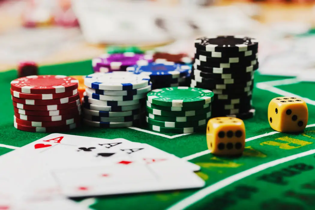
Poker chips are a prime example of color psychology in table games. Each color typically represents a different value, making it easy for players to recognize and differentiate between chip denominations. The standard colors used in poker chips include:
- White: Often the lowest denomination, white chips can evoke feelings of simplicity and neutrality.
- Red: Higher in value than white, red chips are vibrant and can signify energy and urgency, encouraging competitive play.
- Blue: Representing mid-range values, blue chips are calming and can promote strategic thinking.
- Green: Often used for higher denominations, green chips can symbolize growth and prosperity, adding to the excitement of winning.
- Black: Typically the highest denomination in many games, black chips exude a sense of power and exclusivity.
These color choices are not random; they are designed to make the game intuitive and visually stimulating.
Example: Monopoly
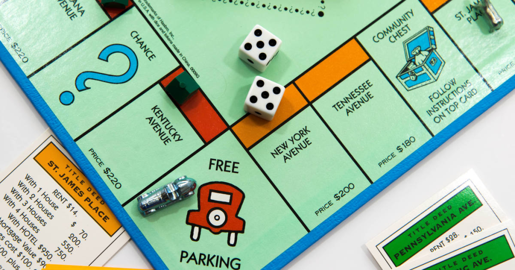
The classic board game Monopoly uses color psychology effectively:
- Property Colors: Different colored property sets help players quickly identify and group properties. The progression from light colors (like light blue) for cheaper properties to darker colors (like dark blue) for expensive ones creates a sense of value hierarchy.
- Chance and Community Chest Cards: The orange and blue colors of these cards stand out on the board, drawing attention to these exciting, unpredictable elements of the game.
Example: Uno
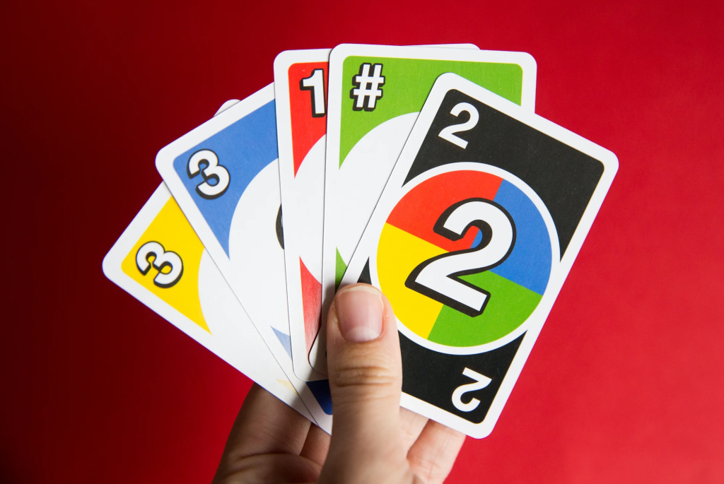
Uno’s color-based gameplay demonstrates how colors can be central to game mechanics:
- The bold, primary colors (red, blue, yellow, green) make the game accessible and easy to understand.
- The bright colors create a fun, energetic atmosphere that matches the fast-paced nature of the game.
Color in Digital Game Design
In digital game design, colors are used extensively to create immersive worlds and influence player emotions. Here are a few ways color psychology is applied in digital games:
1. Character Design:
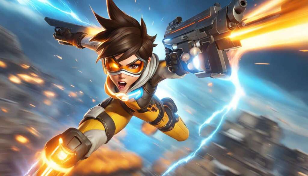
Colors can define characters’ personalities and roles. Heroes might wear bright, bold colors, while villains are often depicted in darker shades. Example: In “Overwatch,” the character Tracer wears bright orange and yellow, reflecting her energetic and positive personality, while the villain Reaper is clad in black, emphasizing his dark and mysterious nature.
2. Environment Design
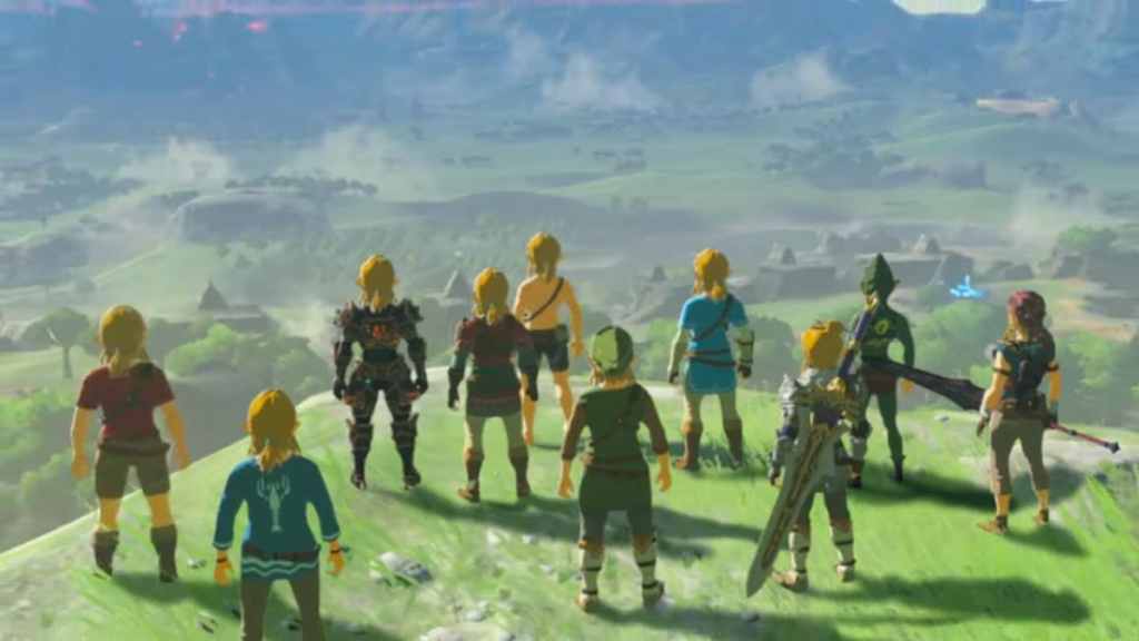
Game worlds are brought to life with color. A lush green forest can evoke a sense of adventure and tranquility, while a fiery red lava level can create tension and challenge. Example: “The Legend of Zelda: Breath of the Wild” uses a vibrant, pastel color palette to create a sense of wonder and exploration. The soft blues and greens of the world invite players to explore, while the harsh reds of enemy lairs signal danger. This principle extends to online games as well. Some online pokies in Australia use rich golds and deep blues to create an atmosphere of luxury and mystery, enhancing the thrill of the game.
User Interface (UI)

The UI’s color scheme can affect how players interact with the game. Clear, contrasting colors can make the interface intuitive, while harmonious colors can ensure it doesn’t distract from gameplay. Example: In “Fortnite,” the UI uses bright, contrasting colors to make important information stand out. The blue health bar and green shield bar are easily distinguishable, allowing players to quickly assess their status during intense gameplay.
Emotional Storytelling
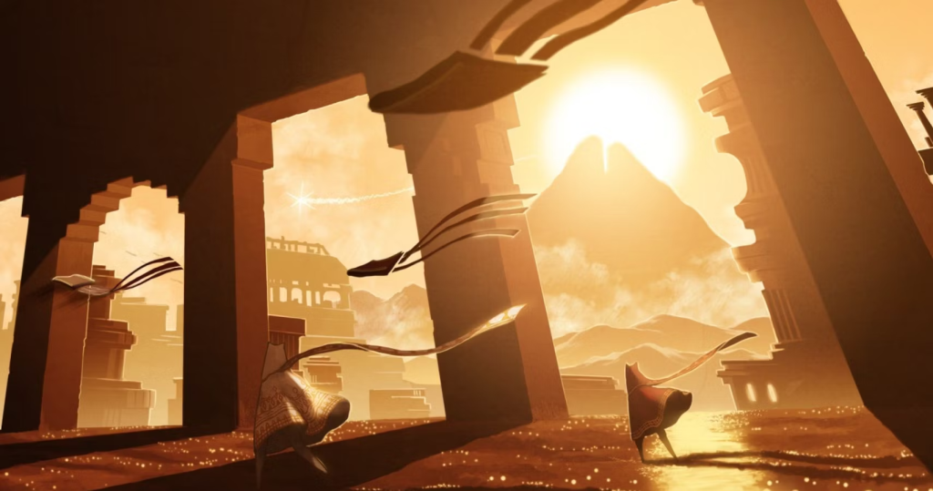
Colors can be used to enhance storytelling and evoke specific emotions. Example: In “Journey,” the game starts with warm, golden hues, creating a sense of hope and adventure. As the player progresses, the color palette shifts to cooler blues and purples, reflecting the increasing challenges and emotional depth of the journey.
“When we were kids playing in the playground we are really learning about our own bodies, and discovering basic social dynamics with other kids. But as you grow older and become a teenager you move to games like basketball and soccer. You learn teamwork. But you rarely see people over 35 still playing these games. That’s because they already learned and mastered those skills. You look at older people and they play Poker. Poker is a game about deception, calculation and manipulation; they are useful skills to master later in life. Golf is another example. Golf isn’t really about the game so much as the social connections. And the interaction and stimulation you get from playing with someone.”
Jenova Chen – Maker of “Journey”- from Eurogamer.net
Player Guidance

Colors can subtly guide players through game environments. Example: In “Mirror’s Edge,” the game uses a stark white environment with bright red objects to guide players along the optimal path, creating an intuitive navigation system without explicit markers.
Conclusion
Looking back, we can see how colors do a lot of heavy lifting in games. They’re not just there to look pretty – they actually change how we play and feel. Think about the peaceful blues in video games or the eye-catching red poker chips. Game makers pick these colors carefully to make their games more fun and exciting. So next time you’re playing a game, take a quick look at the colors around you. You might be surprised at how much they’re doing to make the game better.