The color gray has a fairly bad rep these days. It inspired murky weather, cold skies, boring days inside. However, today we’ll discover together that decorating a room in a gray theme is anything but boring. It can provide a wonderfully calm environment for a bedroom or a neutral base for a chic and sleek nook. Let’s talk about all the different ways you can use gray to decorate your bedroom.
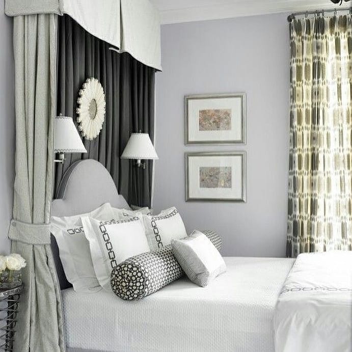
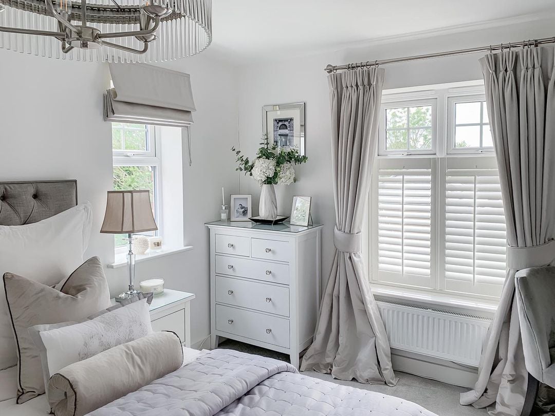
For an elegant flower-adorned interior
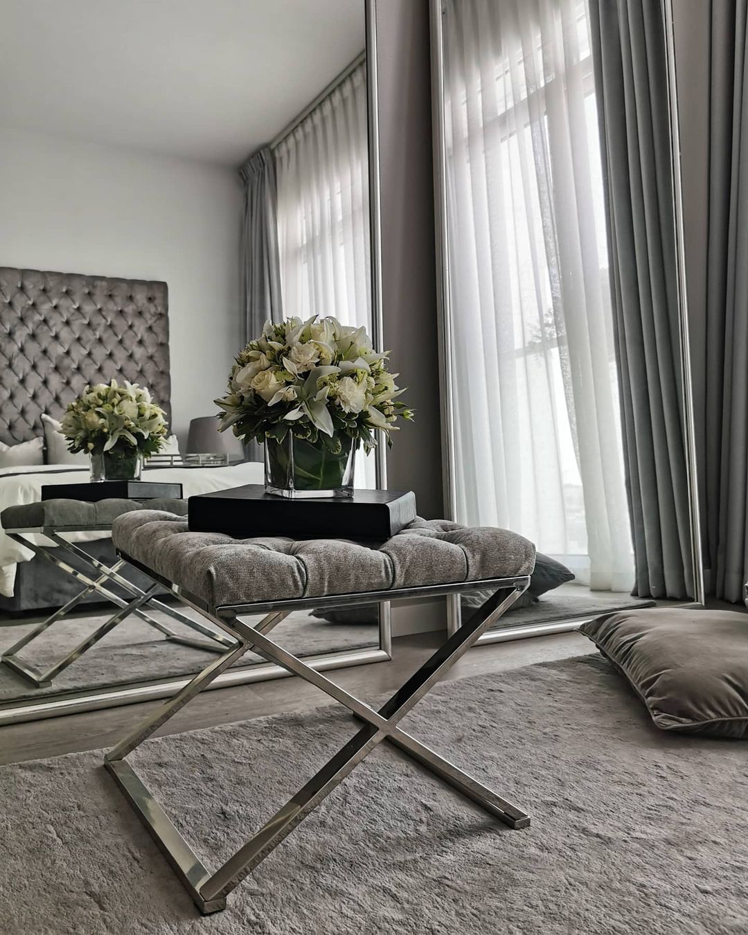
The tufted headboard works beautifully with the cream-colored flowers here. The soft gray walls create a seamless flow with the long light drapes that seem to cascade down the windows. The addition of tall mirrors, a fluffy rug, and a velvet pillow adds calm and depth to the room.
For a modern-rustic look
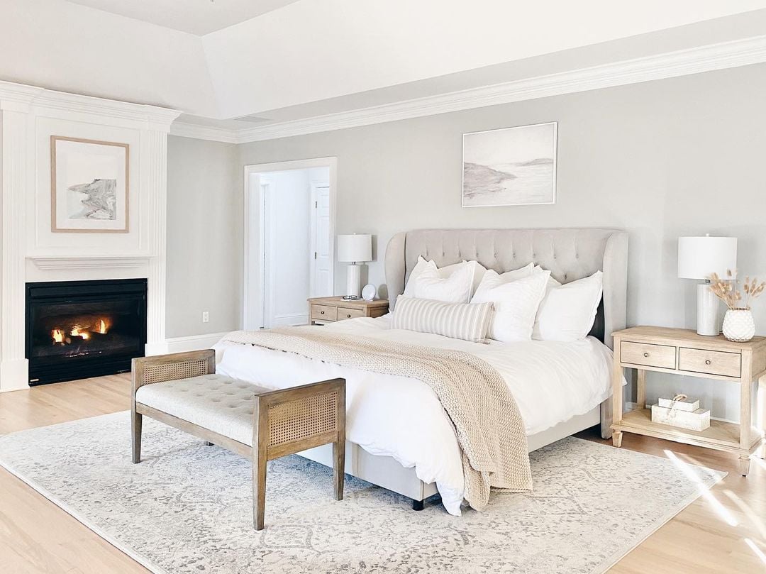
White and gray can work exquisitely well together, especially when paired with wood furniture and flooring, to create a soft, elegant, and somewhat of a modern take on a rustic bedroom.
For a play on texture
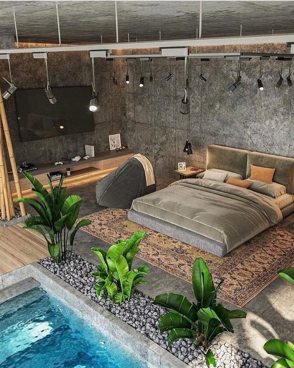
The color gray also allows for a fun play-on texture. This extravagant but playful example shows that you can layer gray textures and surfaces to create a beautiful bedroom. Gray doesn’t have to be cozy; it can also be fun! The velvet comforter and headboard are an amazing addition.
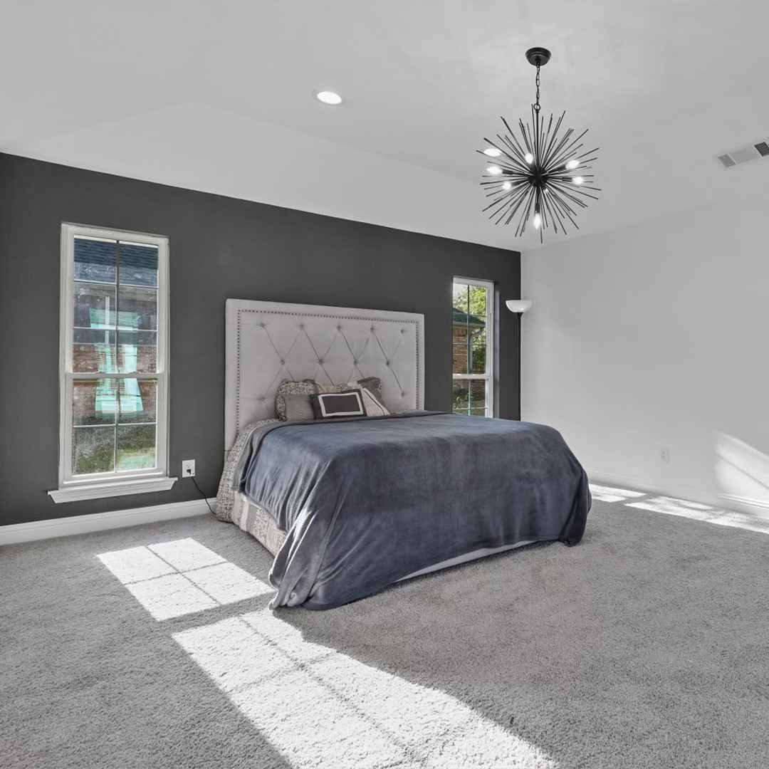
For an industrial look
Gray is the perfect color to achieve a beautiful industrial look in your home. Choose a dark gray combination to set a deep and striking mood all throughout your sleek and modern look.
For an extra touch of gray
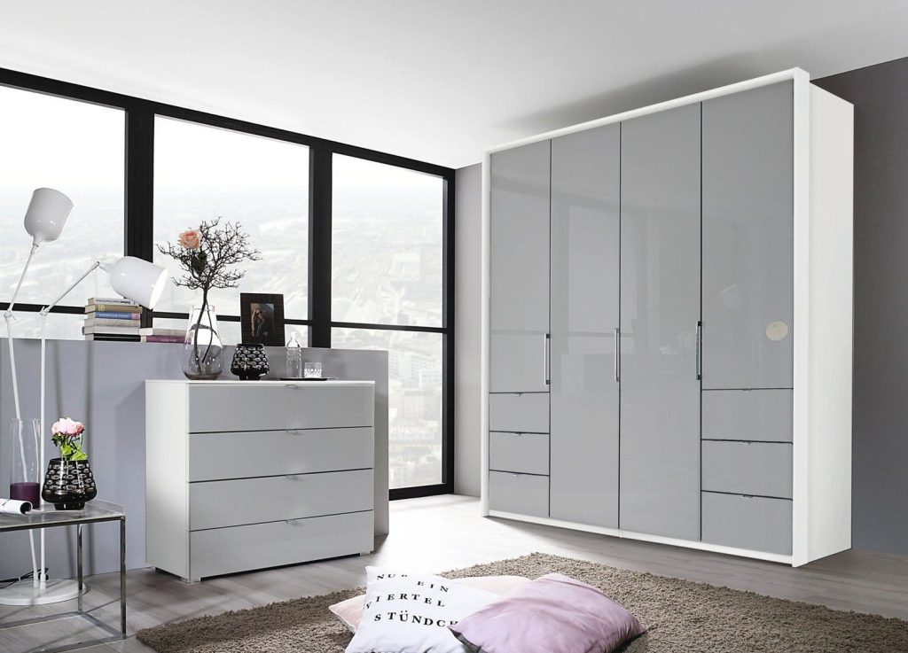
This bedroom is designed to make you feel like you’re in your own little world, with warm hues and a soft, inviting bed and a nice gray wardrobe.
For a paneled closet
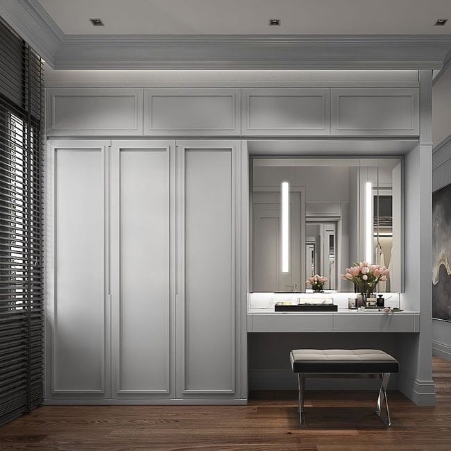
Gray paneling combines an elegant and modern feel. This is a great option if your home has dark wood flooring, as it will offer a perfect contrast with the heavy floors.
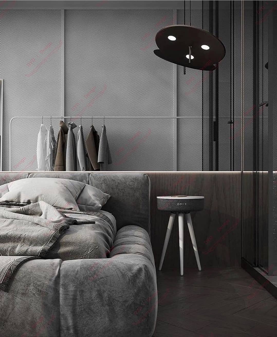
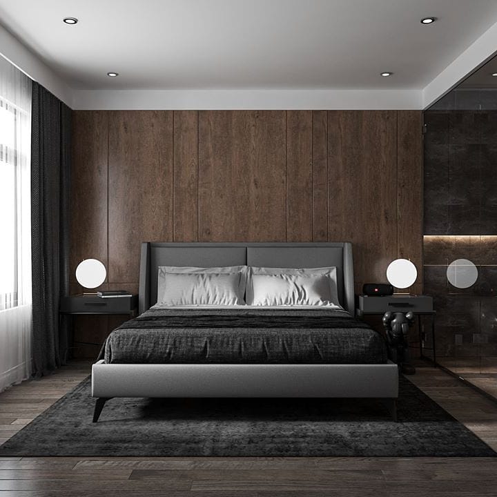
For a touch of warmth
The mix of gray and brown here creates a superbly warm feel throughout the room. The contrast between the matte and glossy textures also offers a striking diversity of textures that perfectly complement the all-gray bed and the sleek lighting.
For an accent wall
Using gray on an accent wall is an effective way of adding depth to a room. In this example, the soft gray carpeting further accentuates an impression of depth, and the gray tufted headboard offers a nice recall of the gray. Add a dark light fixture to follow the accent wall.
For a modern take on a classic feel
This is an effective example of how gray can take a classic look to another level by making it look modern instead of outdated. The different tones of gray work together in creating different layers on the many different fabrics and textures in this room.
For a cool contrast with color
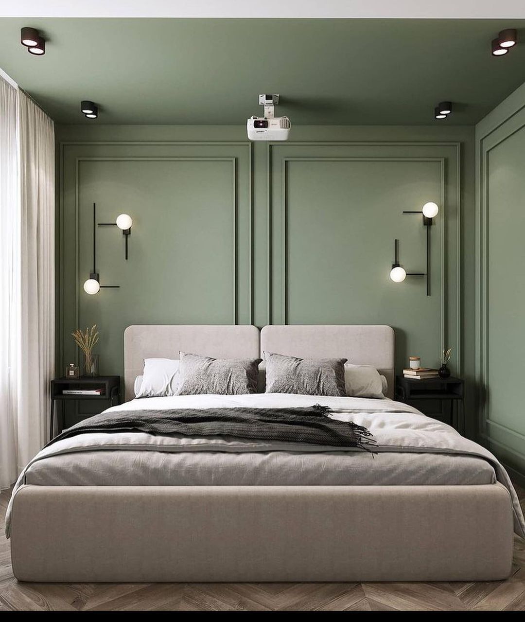
If you would rather adorn your walls with color, choose gray bedding and a gray bed frame to contrast with the striking color of your walls beautifully. This makes for a sophisticated rendition of color in your home to tone down the bright feel the green paneling offers.
For a boho-chic presence
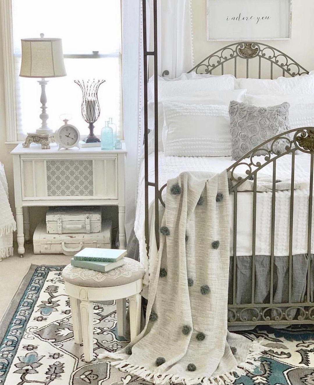
Gray doesn’t have to be inherently modern. It can also be used to create a subtle and soft boho-chic bedroom, paired with a metal bed frame and discreet pastel accents like blue tones in rugs and fabrics.
For a sleek and elegant bedroom
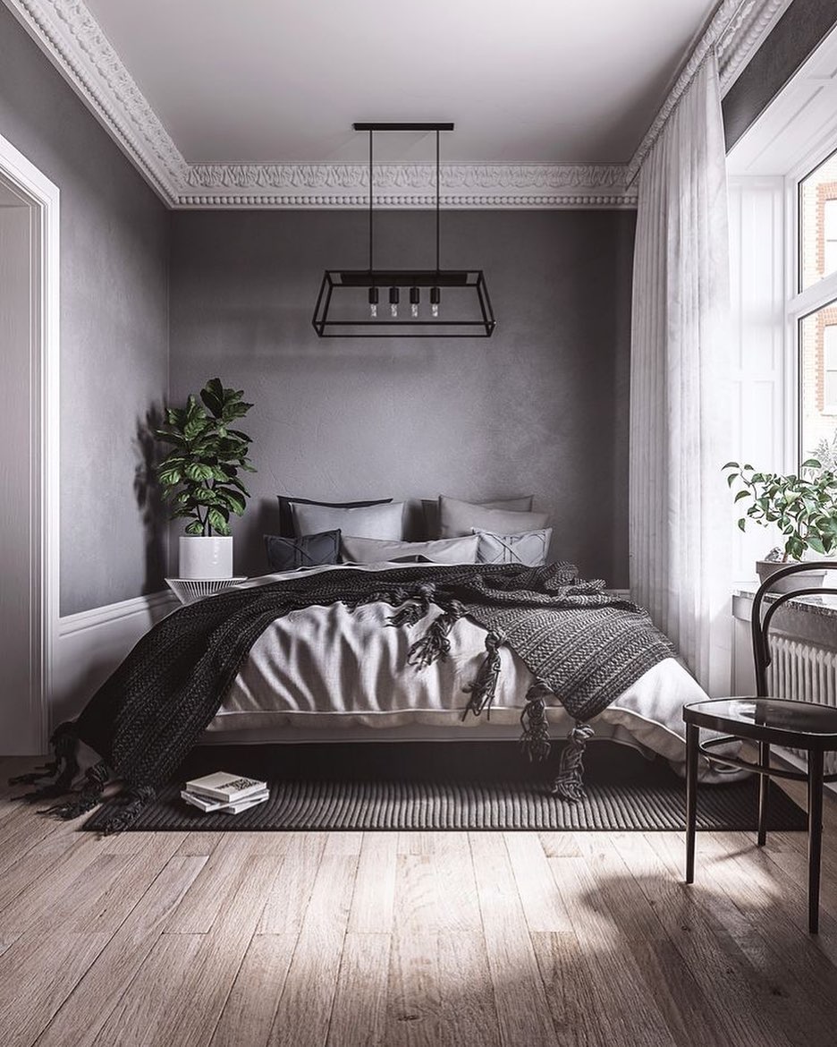
Gray doesn’t have to be painted onto walls; it can also be in the form of wallpaper. Slap on some wallpaper onto your bedroom walls for an easy textured look, and complement the sleek color by adding layers of gray, beige, and black bedding. A rug underneath your bed can help visually anchor it further. Doesn’t this gray wallpaper go wonderfully well with the intricate white crown molding on the ceiling?
For a floral guest bedroom
Add a floral touch to a neutral gray palette for a perfect guest bedroom. Your guests will love staying in a lovely, calming atmosphere provided by floral textures and gray walls.
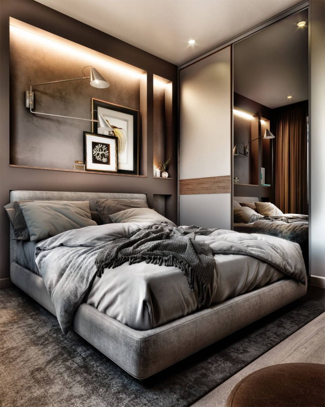
For a sophisticated look
Use dark wood paneling, like Mahogany, to contrast with a deep gray color palette for your bed and textiles and achieve a sophisticated look. In addition, a gray ceiling can help weld the top and the bottom of the room together seamlessly.
For an inviting focus on the bed
Choose a great big metal bed frame with tall posts to contrast with a light gray wall tone and white bedding. The pillow arrangement in this room shows how powerful little accents can be in a room! The gray shaggy rug also complements the overall tone of the room.
For bedrooms with a view
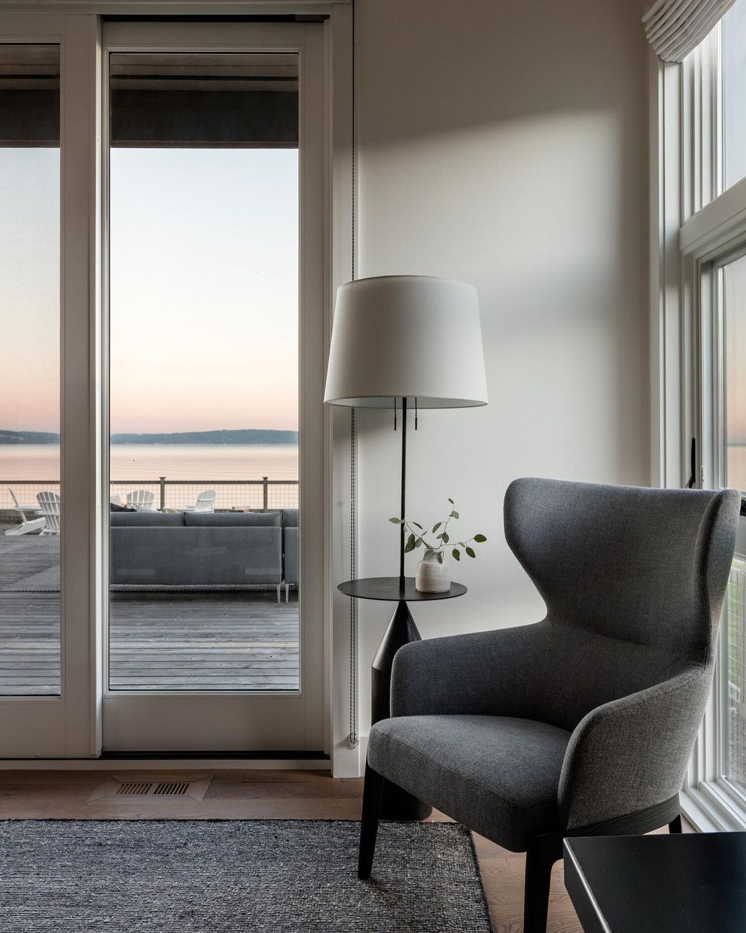
Lastly, adding gray to a bedroom with a view is a beautiful way of drawing the eye to the outdoors. This sumptuous sunset is highlighted by the neutral and calm tones of the bedroom and the soft fabrics of the armchair. Take into account the view when considering the color palette of a room, and opt for gray when you want to draw attention to what’s out of your window or balcony.
Grey bedrooms, a versatile choice
All in all, whether it’s used as a daring experiment in color and texture or a safe option to tone down a room, gray has many uses and can be added to a bedroom with many effects in mind. We have talked about using it to soften a bold color or to add character to a wall, or even to create a smooth flow throughout a room.