A color system is any process that someone would use to produce a desired color. Being able to create colors on demand is important in every avenue of creative and practical design. In this article we will discuss the two most common modern color systems, their history, how they work, and their modern applications.
Let’s start.
CMYK
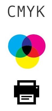
The CMYK color system uses four colors of pigment – cyan, magenta, yellow, and black – to produce a vast array of other colors. It is known as a “subtractive” printing method, meaning that it works by blocking light. White contains all colors, so the printer uses the CMYK process to remove the unwanted colors from a white surface. Four colored layers of a physical pigmented medium (such as ink or dye) are applied to this surface, where they block out the color wavelengths from the light reflected back to the viewer’s eyes.
To achieve the widest possible spectrum of colors, CMYK also uses a technique called “halftoning”, which is when the ink is printed in small dots of various sizes and densities instead of one big block of color. A field of smaller magenta dots, for example, will be perceived by the naked eye at a reasonable distance as the color pink.
CMYK was developed in 1906 by the Eagle Printing Ink Company as an evolution of the CMY process. At the time, color printing used separate “plates” for each of the colors, and if you wanted to use this method to produce the color black, then you would have all three color plates print in that same section of the paper. The section printed in this way would be loaded with a triple layer of wet ink, which in addition to bleeding out detail, increasing drying times, and making the paper more prone to tearing, produced a color closer to dark gray than black. It would also require all three plates to be lined up precisely, making the setup process slower and more complicated. The printers discovered that by using black ink for text and detail, they effectively solved all of these problems and were thus able to achieve high levels of quality and precision, all while lowering costs and reducing the time spent on production.
Interestingly, the “K” in CMYK refers to the fact that the black-ink plate was used as the “key” plate. The three other colored plates used the black plate as a guide for proper alignment.
CMYK is a tried and tested method for color printing that is still the standard today. Modern printers use cartridges loaded with cyan, magenta, yellow, and black ink. Since they are driven by computers instead of relying on plates, there is also a far higher level of precision and quality with modern printers.
RGB
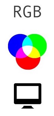
The RGB color system combines red, green, and blue to produce millions of other shades. Unlike CMYK’s subtractive ink method, RGB is designed to work with light emissions and is therefore an “additive” process, meaning that it creates colors by adding red, green, and blue light together in various quantities – for example, combining bright red light with a mid-level green light to produce orange.
Mathematical physicist James Clerk Maxwell first experimented with RGB in 1861 as a method of taking color photographs. He found that he could take three separate photographs of the same object using a different color filter for each photo. He could then shine a white light through the three combined photos to project a full color reproduction onto a white surface. Photographs taken with this method could also be used to produce three printing plates and create colored prints. This color process then became the heart of developing color television, with the first color transmission occurring in 1928 thanks to Scottish engineer and television pioneer John Logie Baird, and the first color broadcast occurring in London in 1938.
The most common application of the RGB color model is in color monitors and displays, located on devices such as televisions, smartphones, and electronic signs. The displays are made up of a field of light-displaying squares called “pixels”, arranged in a grid. Each pixel houses three tiny light sources, one for each color of the RGB process. Since they are so small, the human eye sees them as a single solid color from a normal viewing distance. Every time the image on a display changes, every pixel is sent a code containing three numbers, telling the pixel how bright to make each of its color emitters. The speed at which the pixels in a display can change their colors is called the frame rate, and is typically measured in FPS (frames per second).
The RGB color system is the standard when working with digital graphic design of all types. Color values are most commonly represented in graphics software by three numbers between 0 and 255. However in web design they are instead indicated with a six character hashtag code based on three hexadecimal values between “00” and “ff”. For example, a particular shade of orange that appears as “252, 173, 55” in standard RGB code (representing a red value of 252, a green value of 173, and a blue value of 55) would be called “#fcad37” in web design (with red represented by “fc”, green by “ad”, and blue by “37”). There are numerous color finder programs available online for finding these values.
Conclusion
A working knowledge of how both CMYK and RGB work is vital to modern graphic design, which regularly use digital tools to produce printed goods. Since both color systems work in a completely opposite way, designers must keep in mind what their final product is when producing their designs. Generally speaking, if a designer expects at any time that their work will be printed, then it is a good idea to create designs around the CMYK color system first and then convert the work to RGB for digital applications, since RGB values are far easier to adjust on the fly.







My brother recommended I may like this blog. He was totally right.
This publish actually made my day. You can not believe just how so much time I had spent
for this info! Thanks!