As couples plan their weddings for 2024, they are looking ahead to fresh, on-trend color palettes to style their special day. The new year promises a range of wedding color schemes that are fun, elegant, and full of personality. From earthy natural hues to bold brights and sleek metallics, 2024 will usher in exciting new wedding color trends that capture a couple’s style. When planning a 2024 wedding, choosing fashion-forward colors is one of the most impactful details a bride and groom can select to set the tone for their ceremony and reception. The wedding color palette tells a story about the couple and sets the ambiance of the event through linens, florals, decor and more.
By looking ahead to 2024’s top color trends for weddings, engaged couples can decide on a color scheme that is unique and full of seasonal inspiration for their upcoming nuptials. Popular earthy tones like terra cotta and sage green lend a relaxed boho-chic vibe perfect for outdoor weddings. Vibrant citrus shades provide energy, while midnight blues and jewel tones evoke evening elegance. Soft pastels and blush pinks offer a romantic look. And don’t forget metallics and neutrals that will continue to add modern flair. With so many trending wedding colors to choose from, 2024 brides and grooms can find the perfect palette to bring their wedding vision to life.
Neo Mint
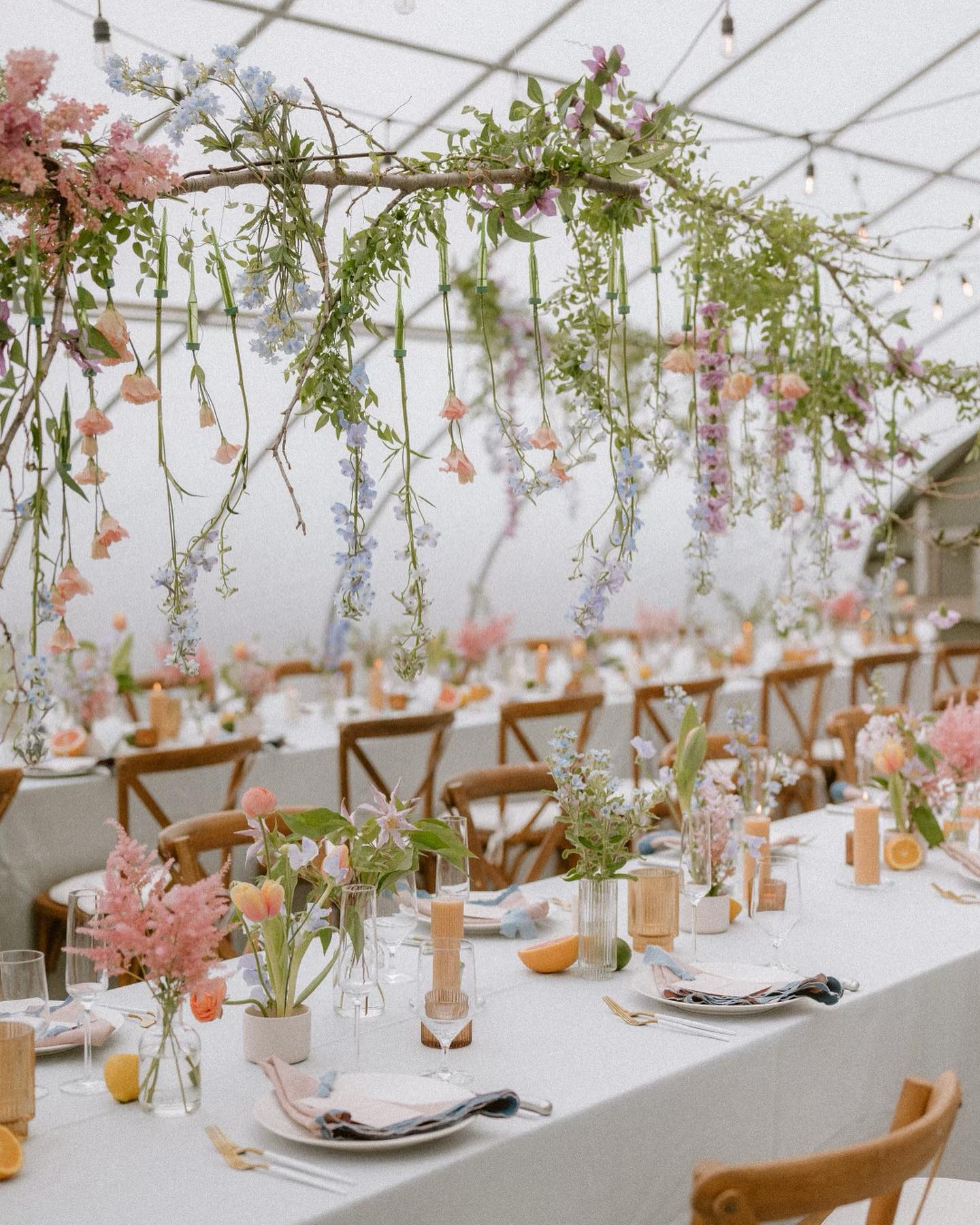
Neo Mint is a soft and calming shade of green that is perfect for spring and outdoor weddings. This color is versatile and pairs well with a variety of flowers and greenery. If you’re looking for a fresh and natural look, Neo Mint is the perfect choice. You can incorporate this color into your wedding through bouquets, centerpieces, and even the bridesmaids’ dresses.
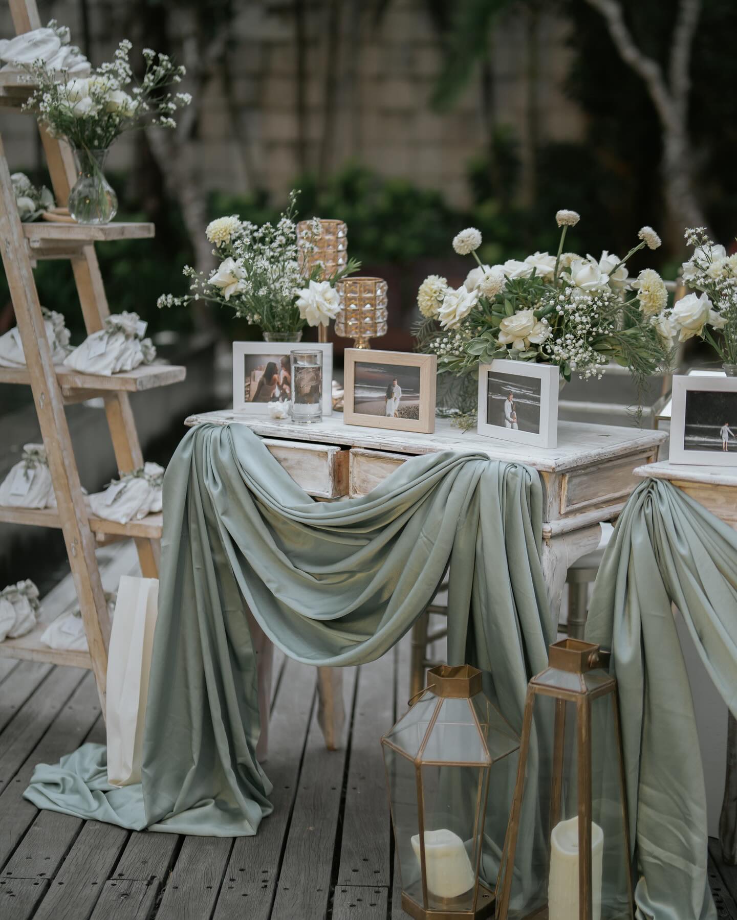
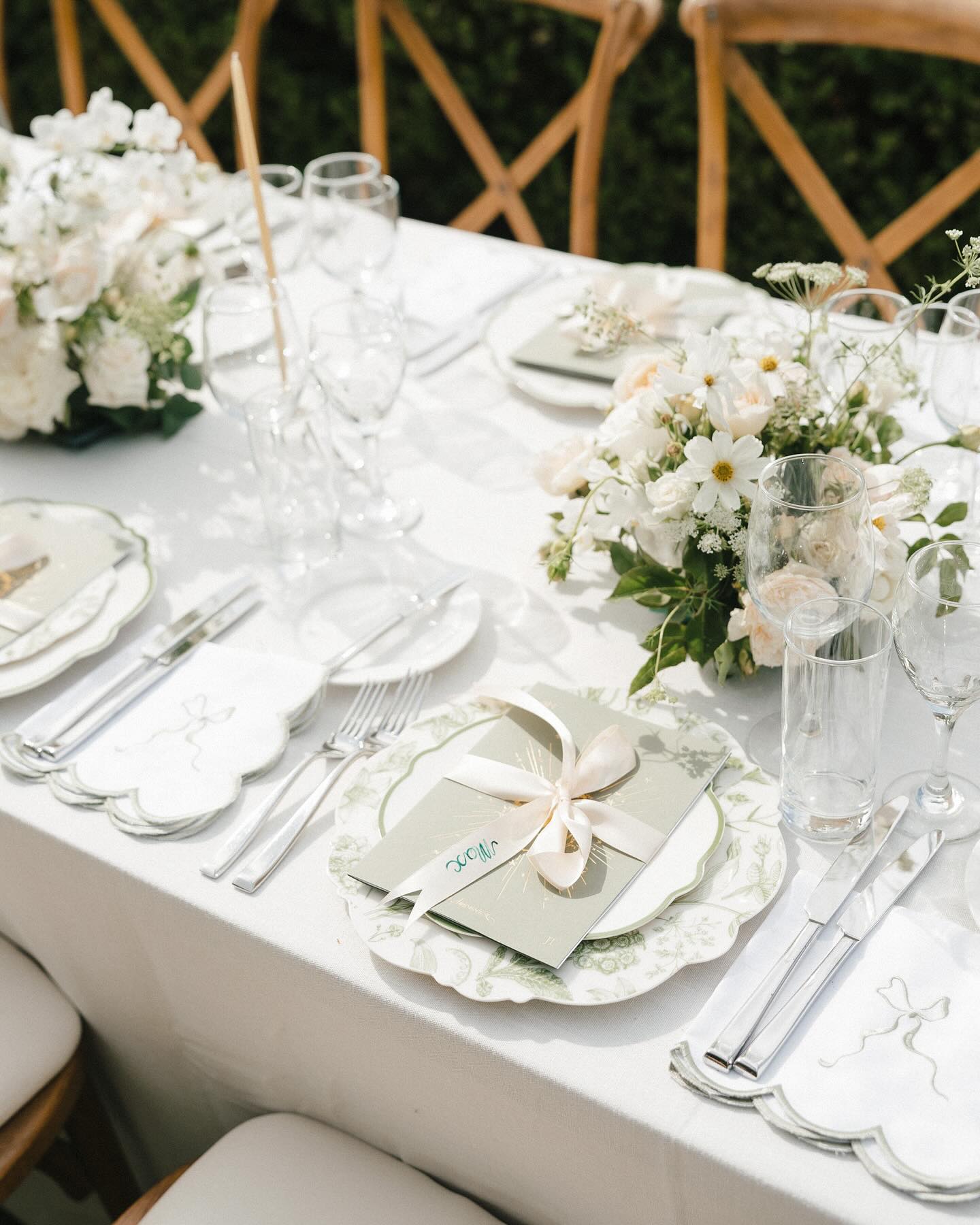
For a spring wedding, consider pairing Neo Mint with pastel shades like lavender and peach. For an outdoor wedding, consider incorporating natural elements like branches, leaves, and flowers to bring the outdoors in.
Flamingo Pink
Flamingo Pink is a vibrant and playful shade of pink that is perfect for a fun and lively wedding celebration. This color is great for a summer or beach wedding and is sure to bring a touch of whimsy and fun to your big day. You can incorporate this color into your wedding through bouquets, centerpieces, and even the bridesmaids’ dresses.
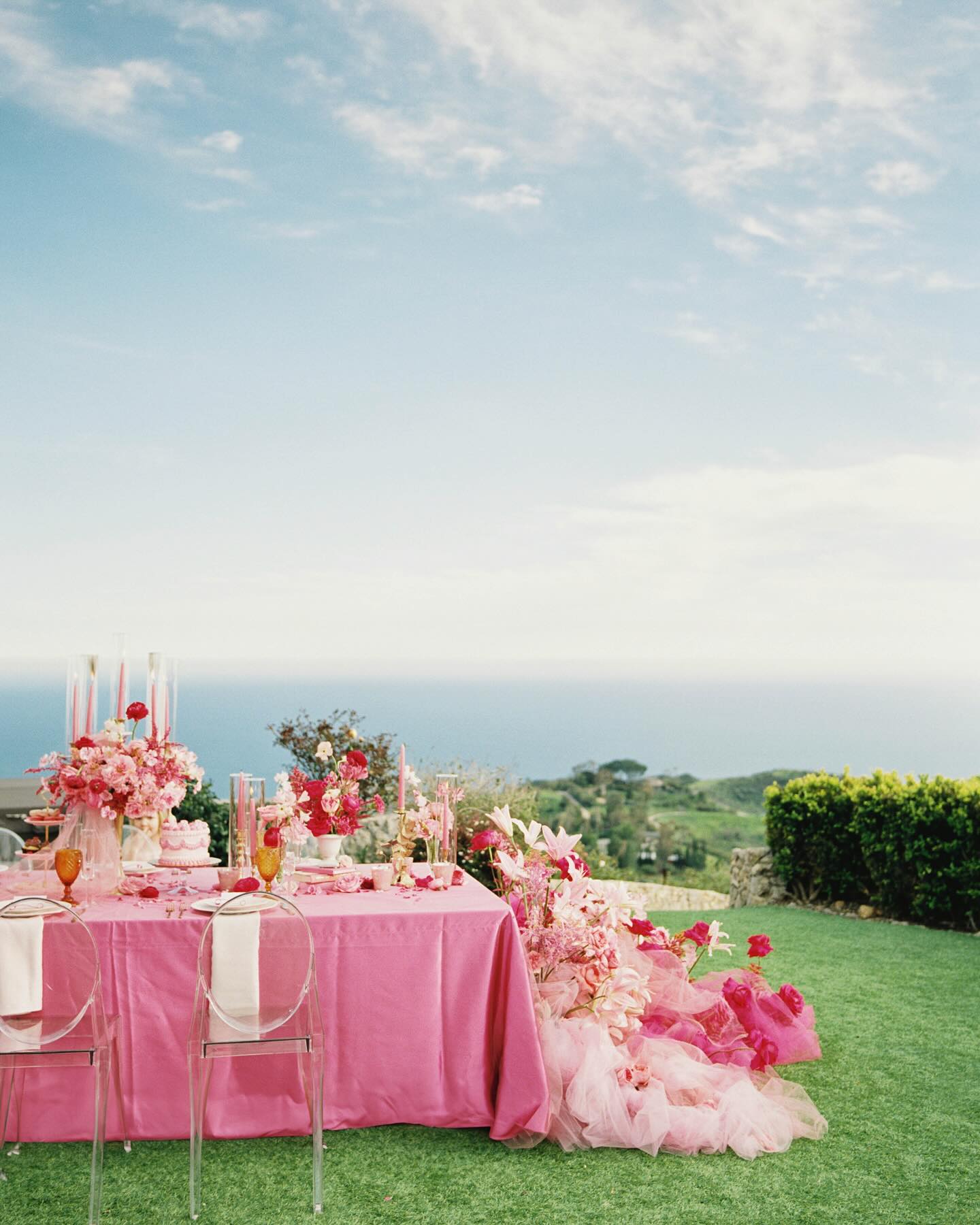
Consider pairing Flamingo Pink with coral and turquoise for a beach wedding, or with gold or silver accents for a more formal wedding.
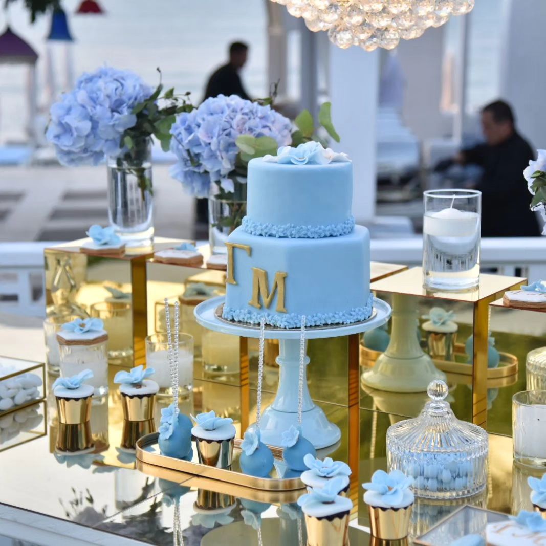
Stormy Blue
Stormy Blue is a moody and romantic shade of blue that is ideal for a sophisticated and elegant wedding. This color is perfect for a fall or winter wedding and is sure to create a dramatic and romantic atmosphere. You can incorporate this color into your wedding through bouquets, centerpieces, and even the bridesmaids’ dresses.
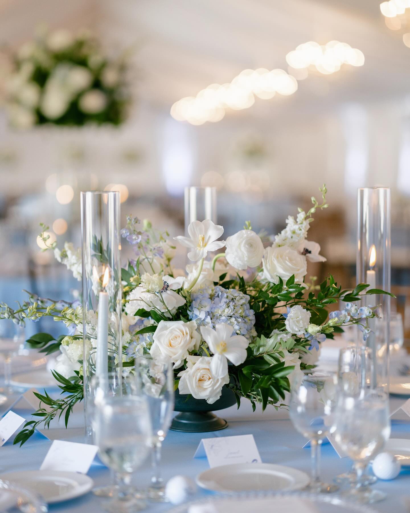
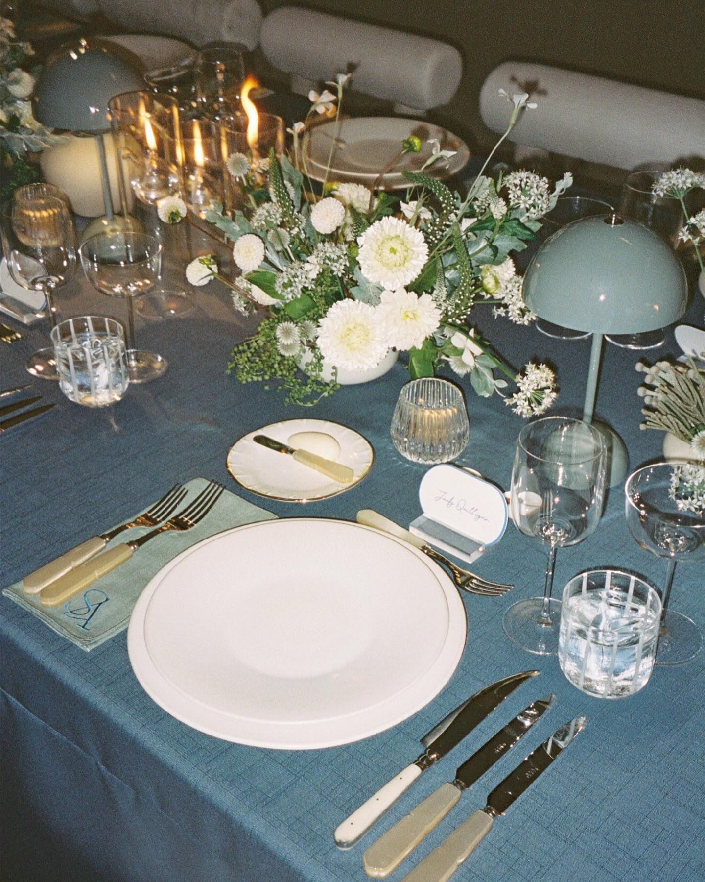
Consider pairing Stormy Blue with warm shades like orange and yellow for a fall wedding, or with icy shades like silver and white for a winter wedding.
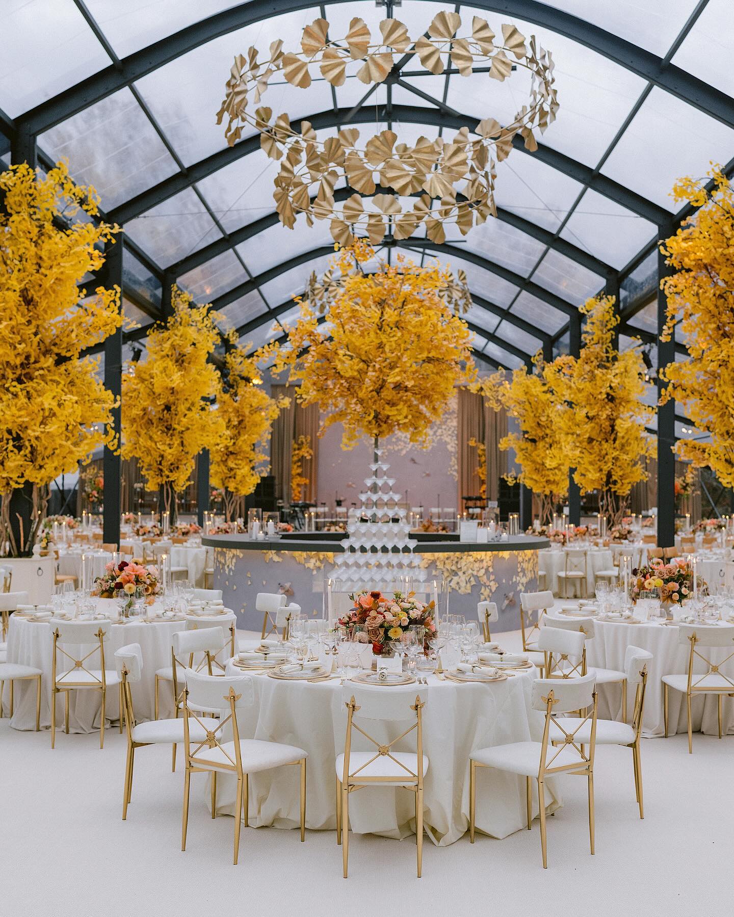
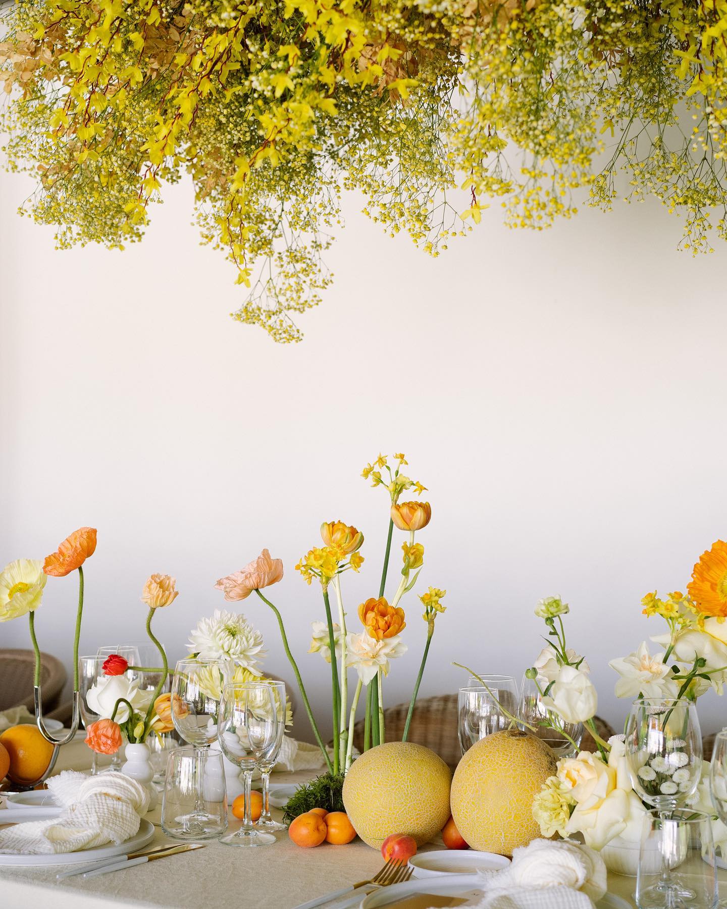
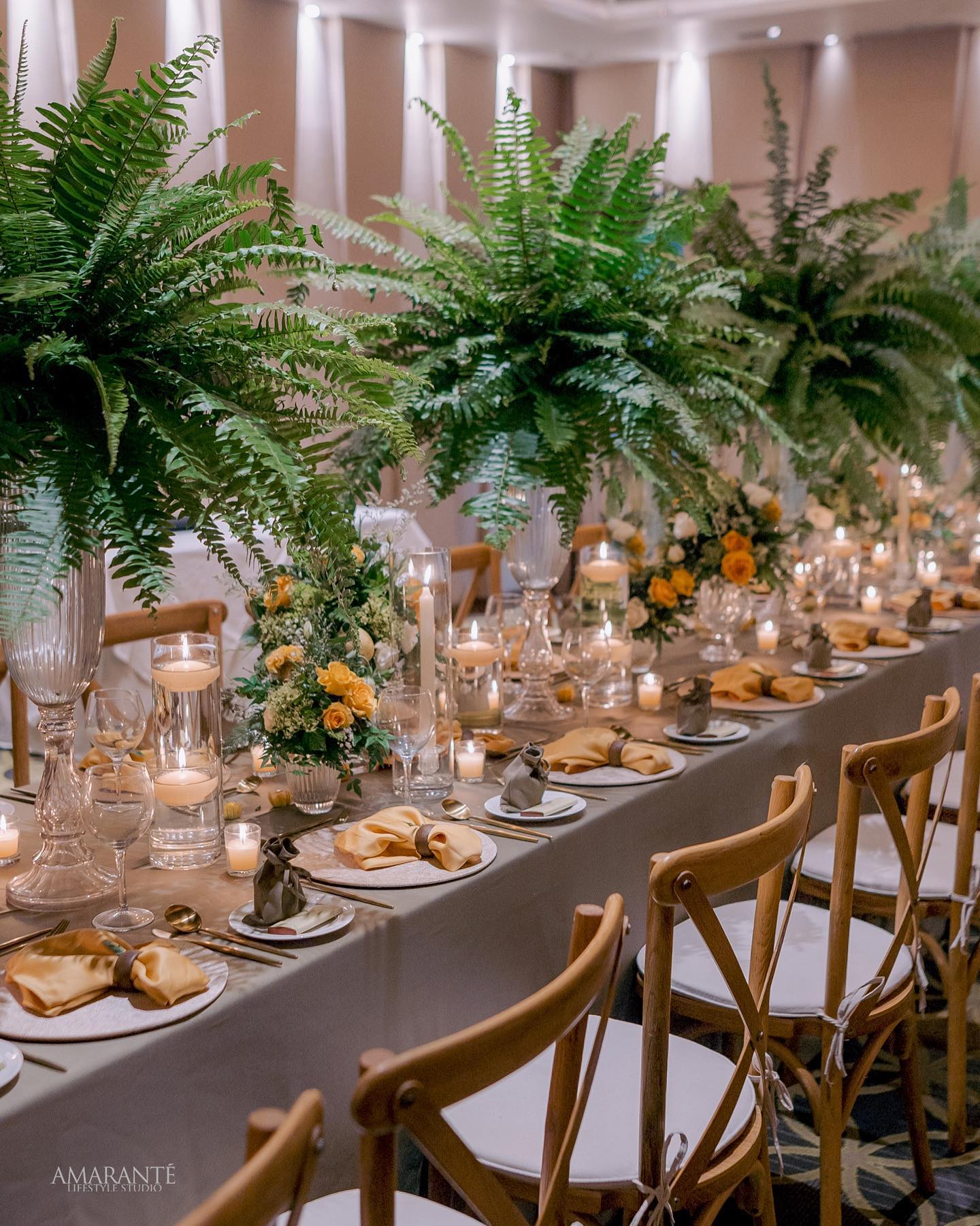
Sunny Yellow
Sunny Yellow is a bright and cheerful shade of yellow that is perfect for a happy and uplifting wedding celebration. This color is great for a spring or summer wedding and is sure to bring a touch of sunshine and joy to your big day. You can incorporate this color into your wedding through bouquets, centerpieces, and even the bridesmaids’ dresses.
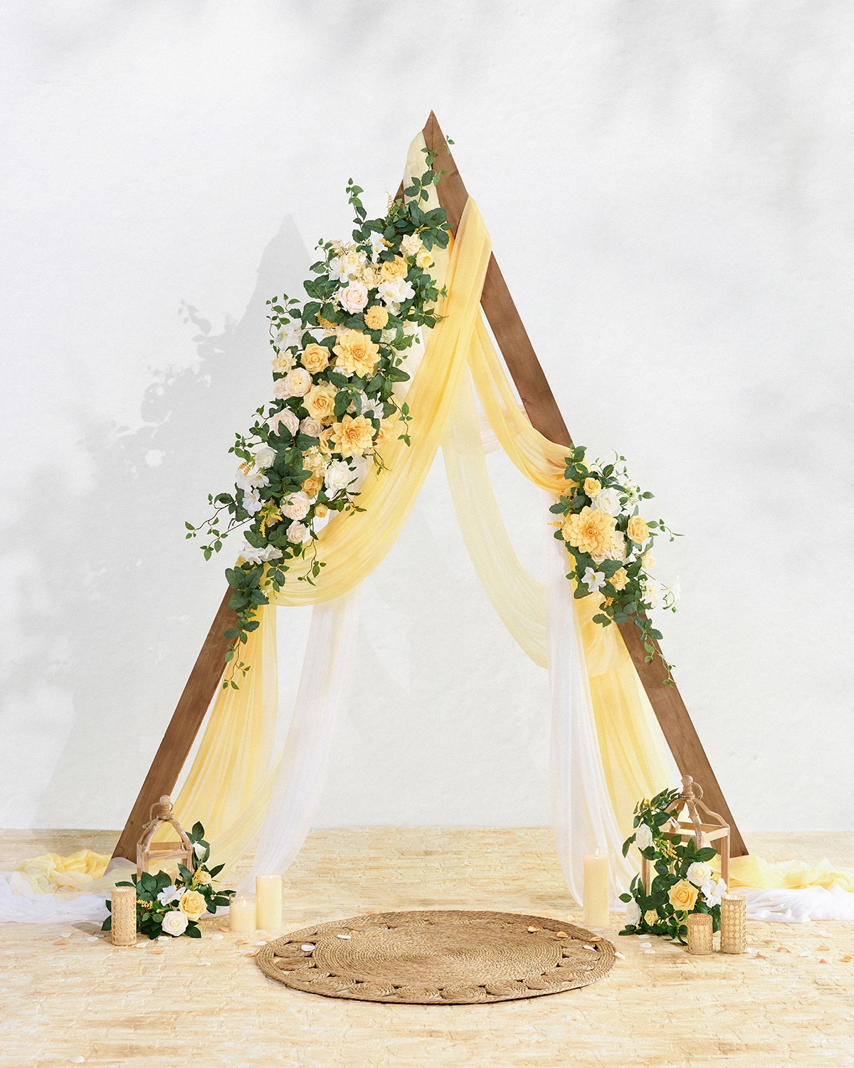

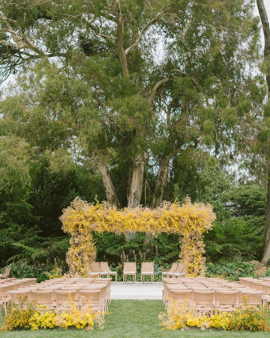
Consider pairing Sunny Yellow with pastel shades like mint and peach for a spring wedding, or with bold shades like red and orange for a summer wedding.
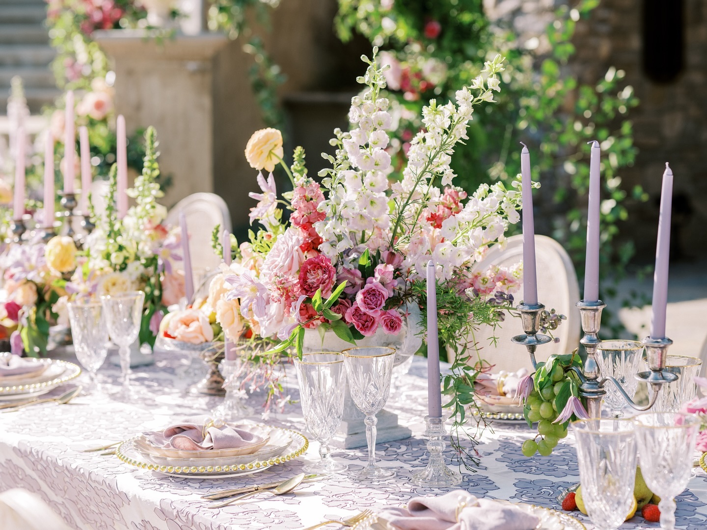
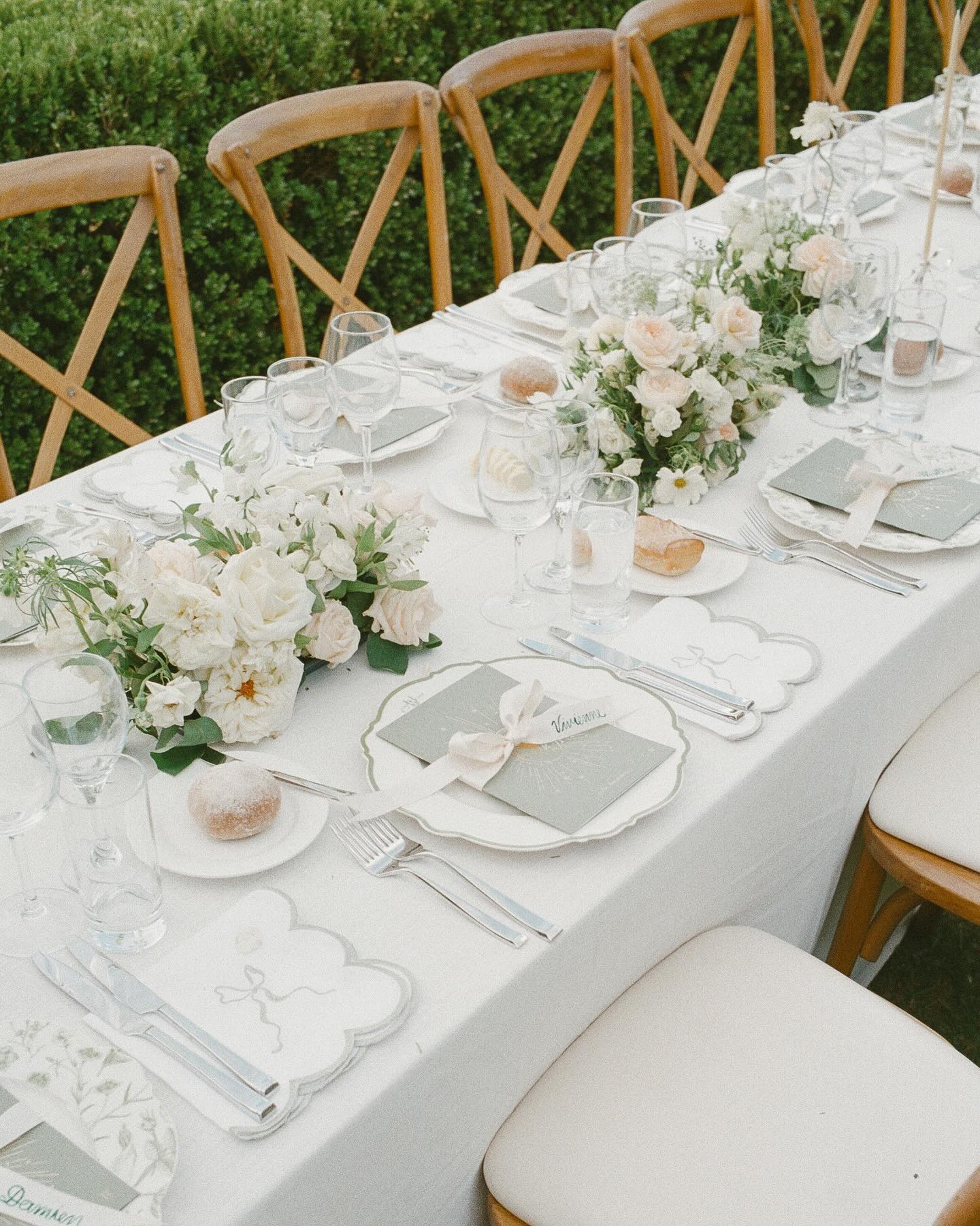
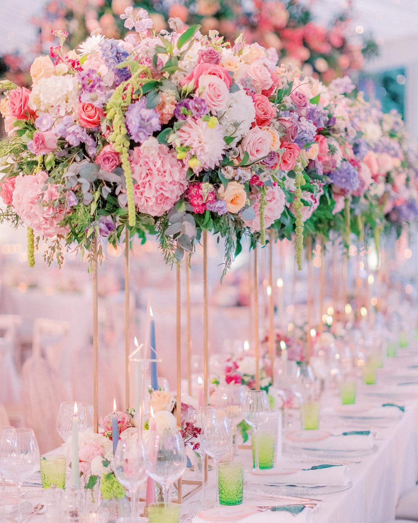
Blush Lavender
Blush Lavender is a soft and feminine shade of purple that is a popular choice for a romantic and vintage-inspired wedding. This color is great for a spring or summer wedding and is sure to add a touch of elegance and sophistication to your big day. You can incorporate this color into your wedding through bouquets, centerpieces, and even the bridesmaids’ dresses.
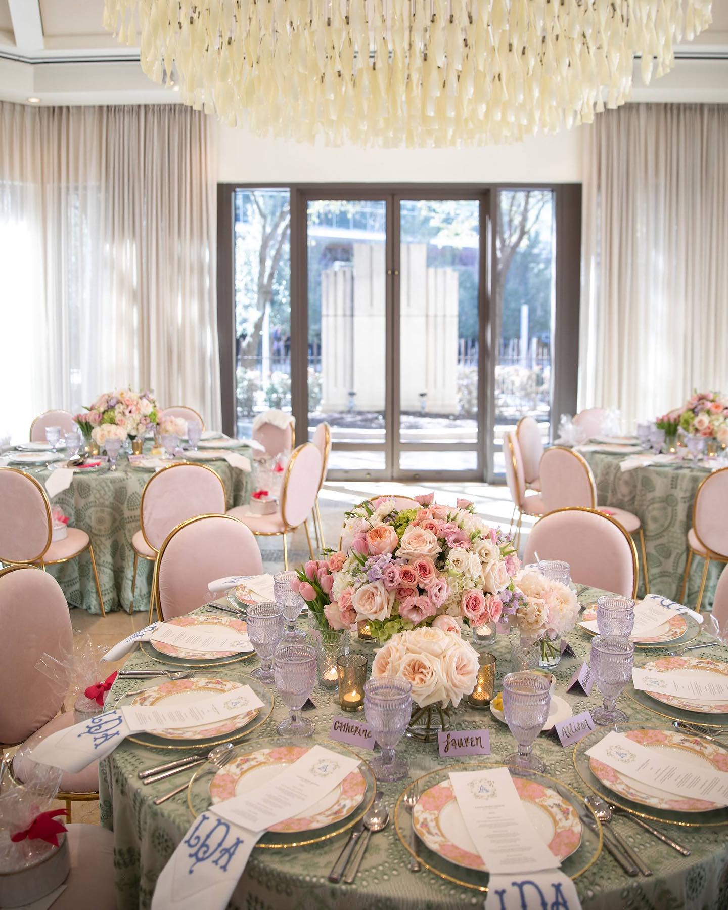
Consider pairing Blush Lavender with lace, tulle, and other delicate fabrics for a vintage-inspired wedding.
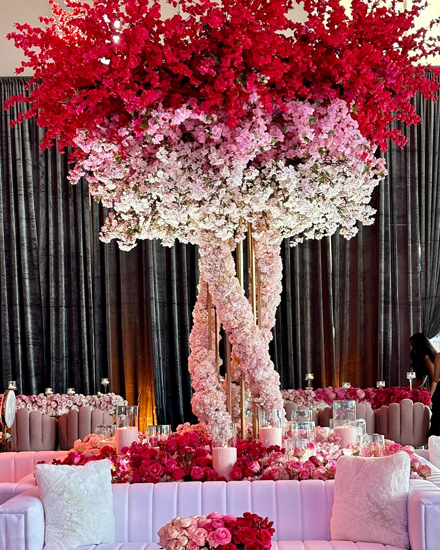
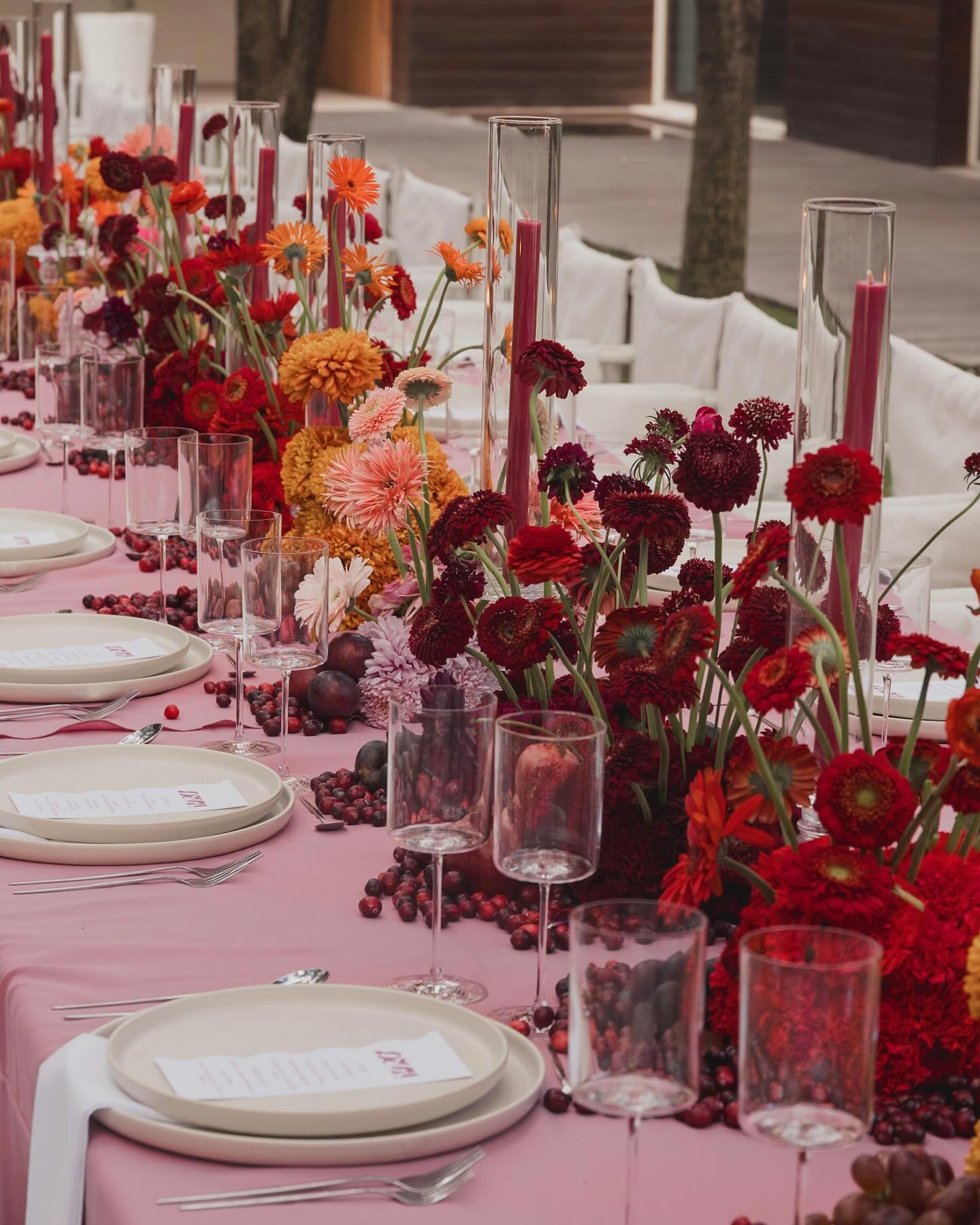
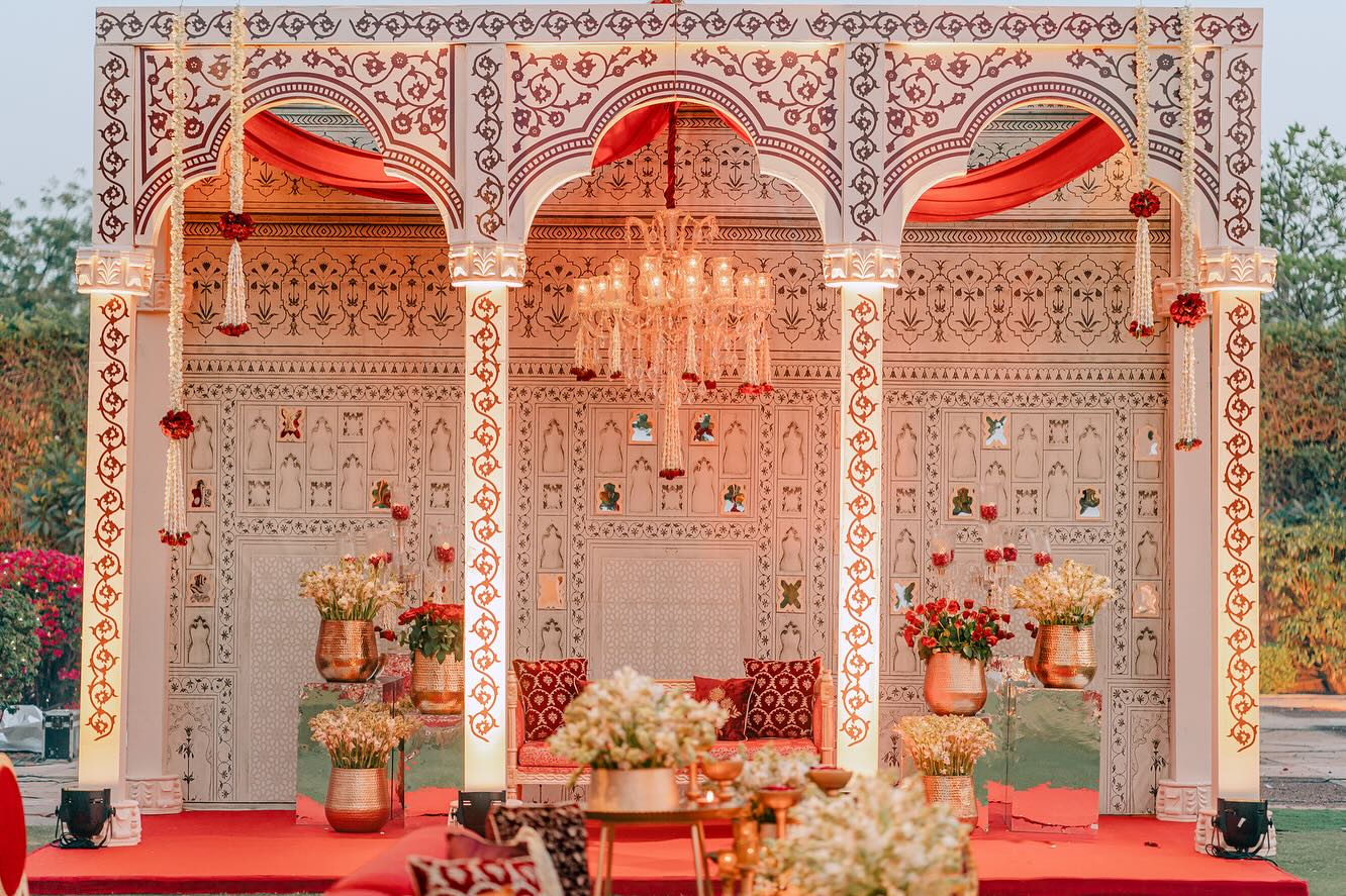
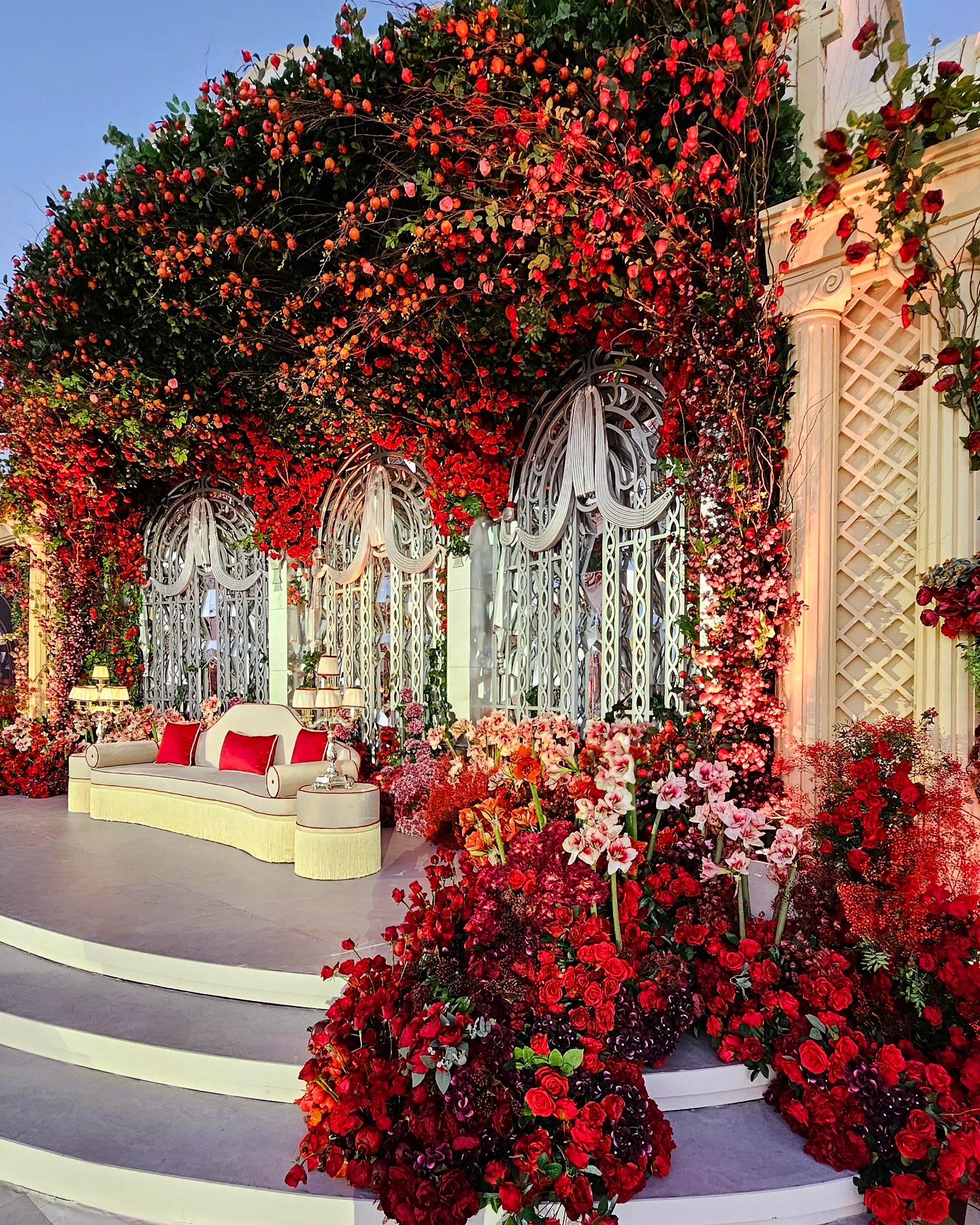
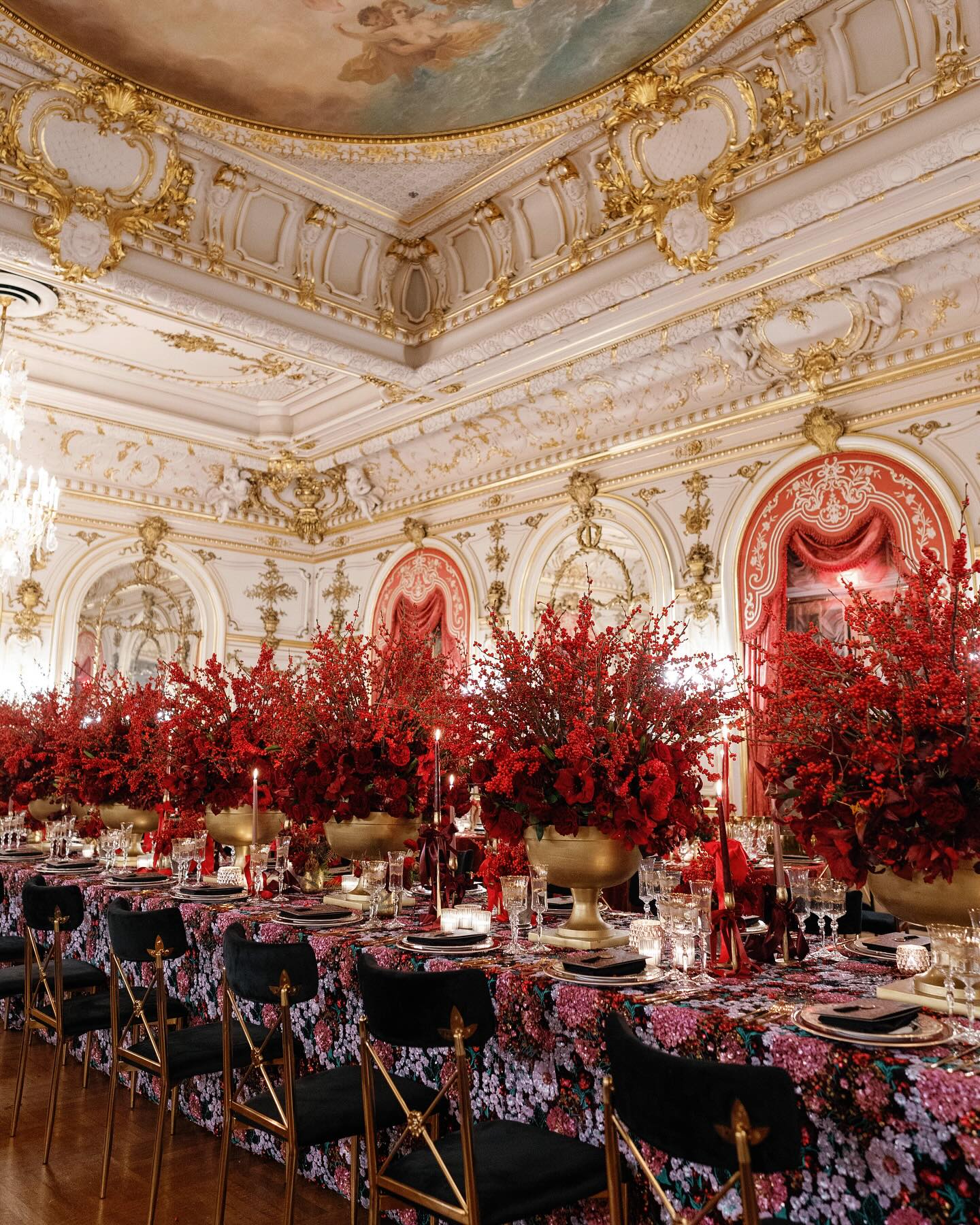
Bold Red
Bold Red is a bold and striking shade of red that is perfect for a glamorous and dramatic wedding celebration. This color is great for a winter or fall wedding and is sure to make a statement. You can incorporate this color into your wedding through bouquets, centerpieces, and even the bridesmaids’ dresses.
Consider pairing Bold Red with icy shades like silver and white for a winter wedding, or with warm shades like orange and yellow for a fall wedding.
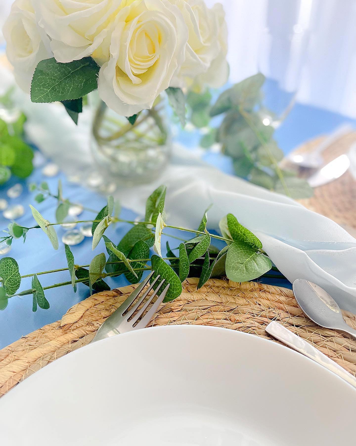
Minty Fresh
Minty Fresh is a soft and refreshing shade of green that is a popular choice for a spring or outdoor wedding. This color is versatile and pairs well with a variety of flowers and greenery. If you’re looking for a fresh and natural look, Minty Fresh is the perfect choice. You can incorporate this color into your wedding through bouquets, centerpieces, and even the bridesmaids’ dresses.
Consider pairing Minty Fresh with pastel shades like lavender and peach for a spring wedding, or with natural elements like branches, leaves, and flowers for an outdoor wedding.
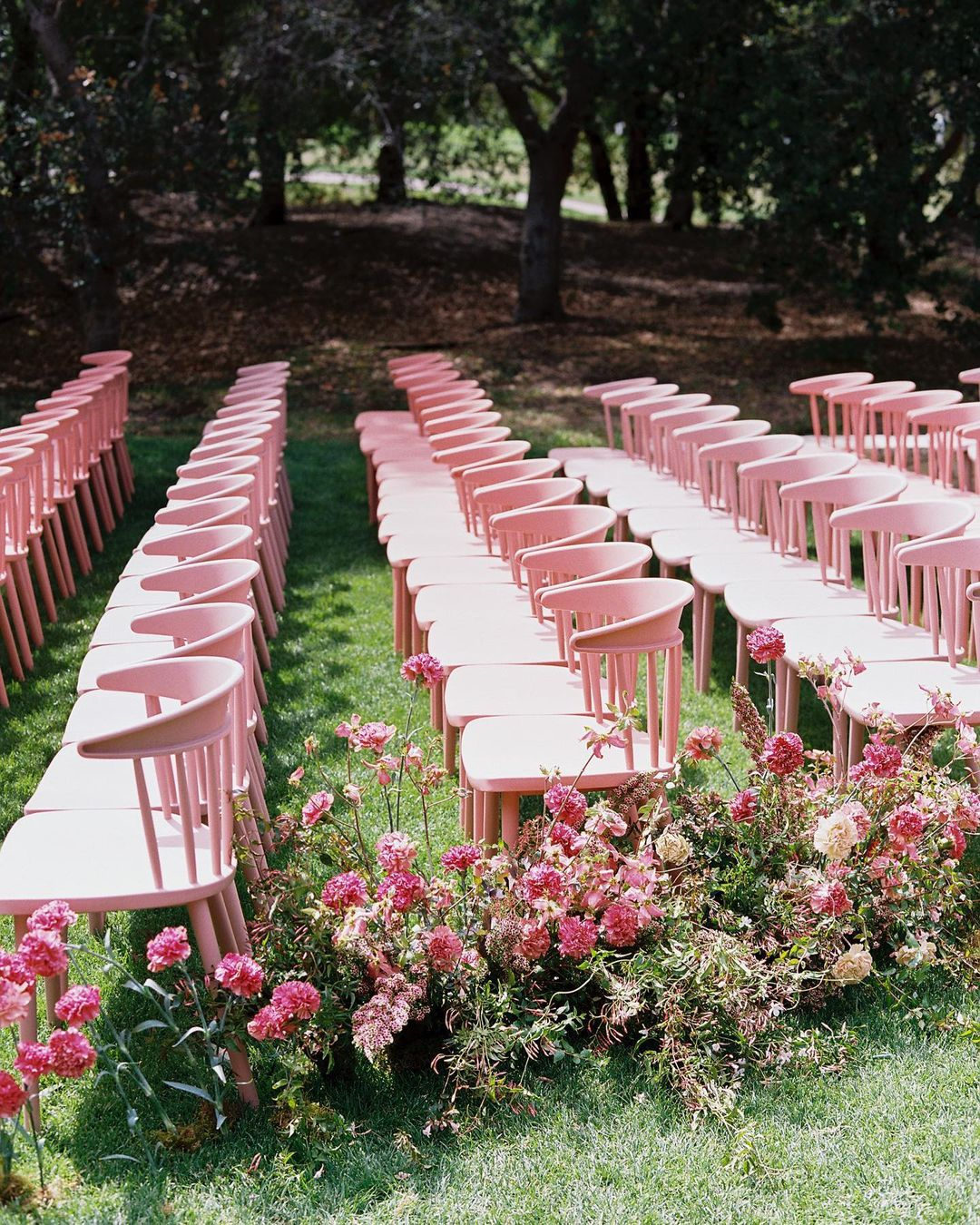
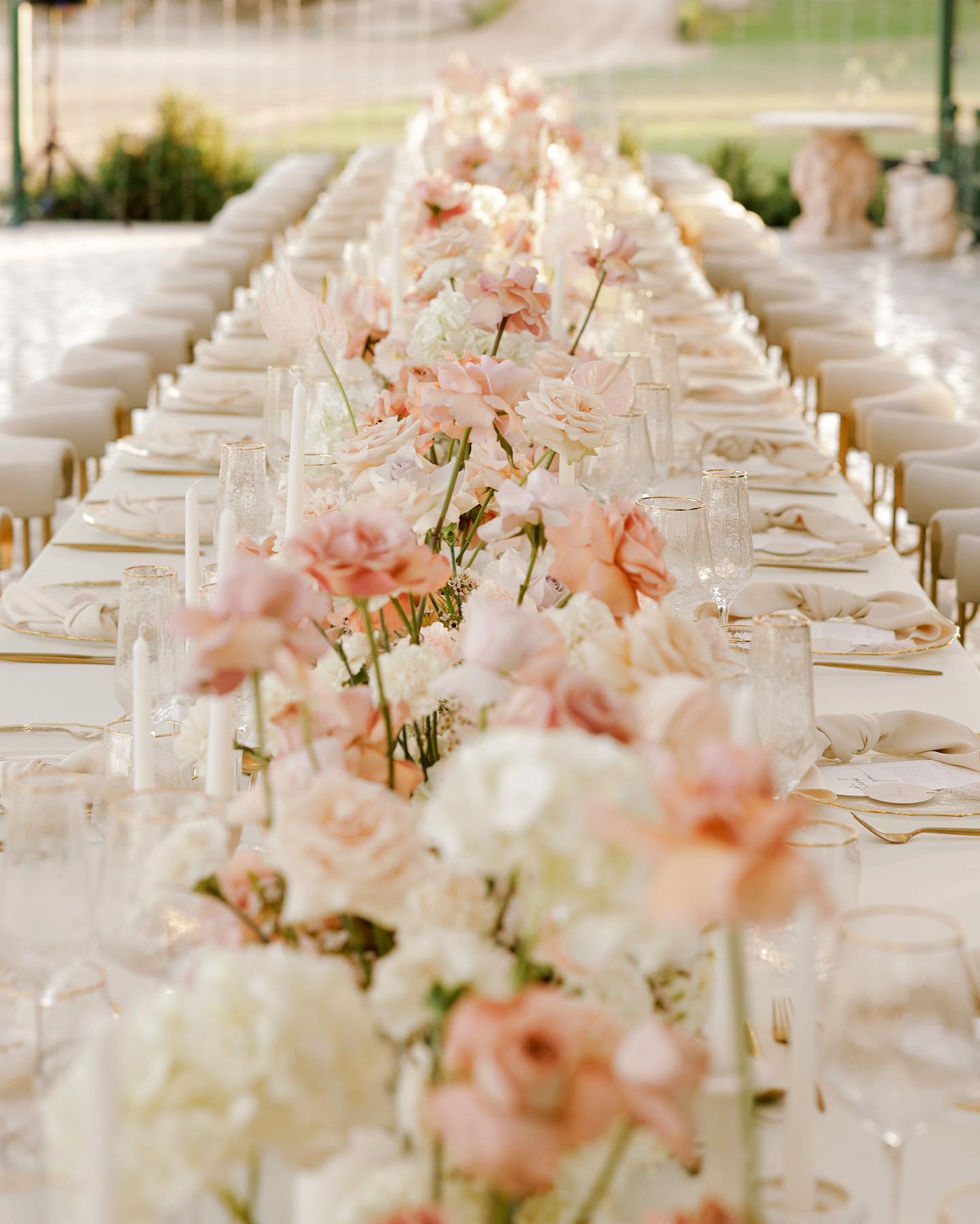
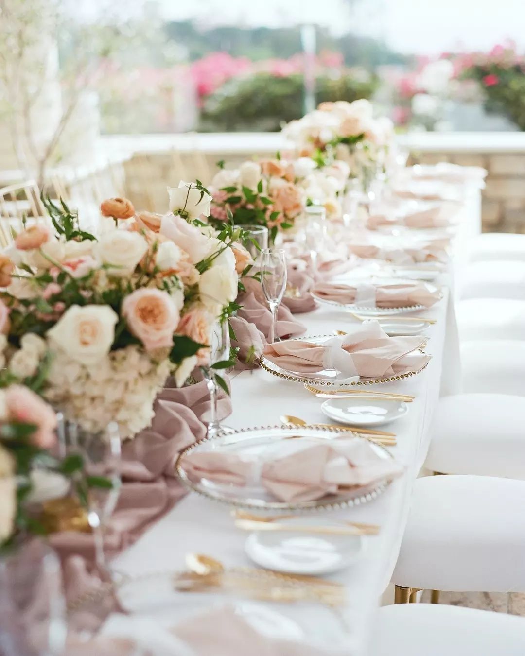
Dusky Rose
Dusky Rose is a soft and romantic shade of pink that is perfect for a vintage-inspired or bohemian-themed wedding. This color is great for a spring or summer wedding and is sure to add a touch of romance and whimsy to your big day. You can incorporate this color into your wedding through bouquets, centerpieces, and even the bridesmaids’ dresses.
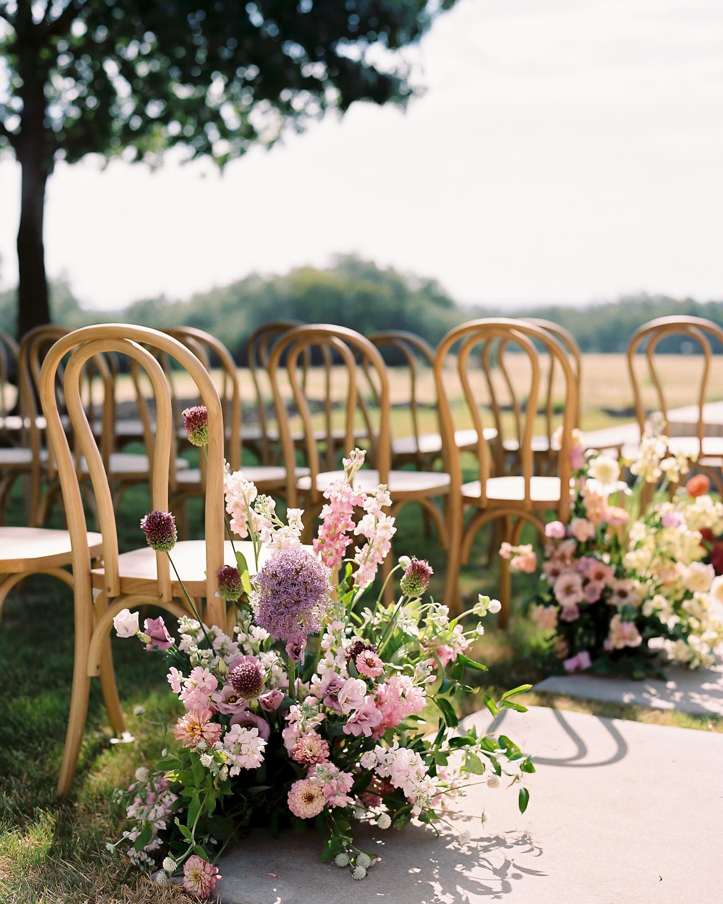
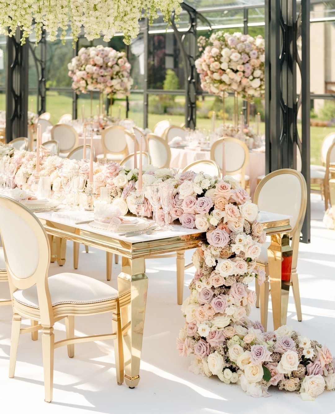
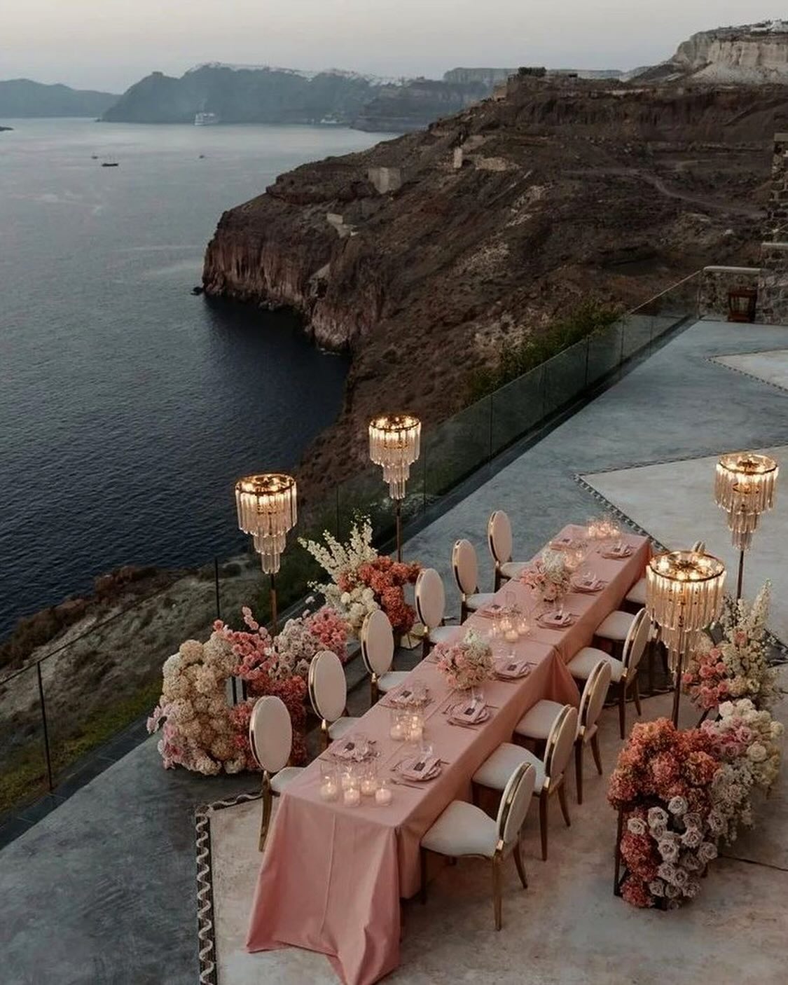
Consider pairing Dusky Rose with earthy shades like olive and terracotta for a bohemian-inspired wedding, or with lace, tulle, and other delicate fabrics for a vintage-inspired wedding.
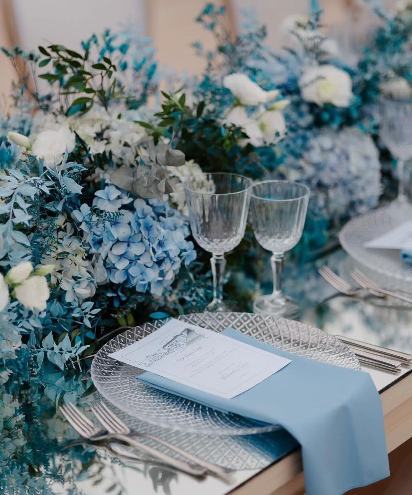
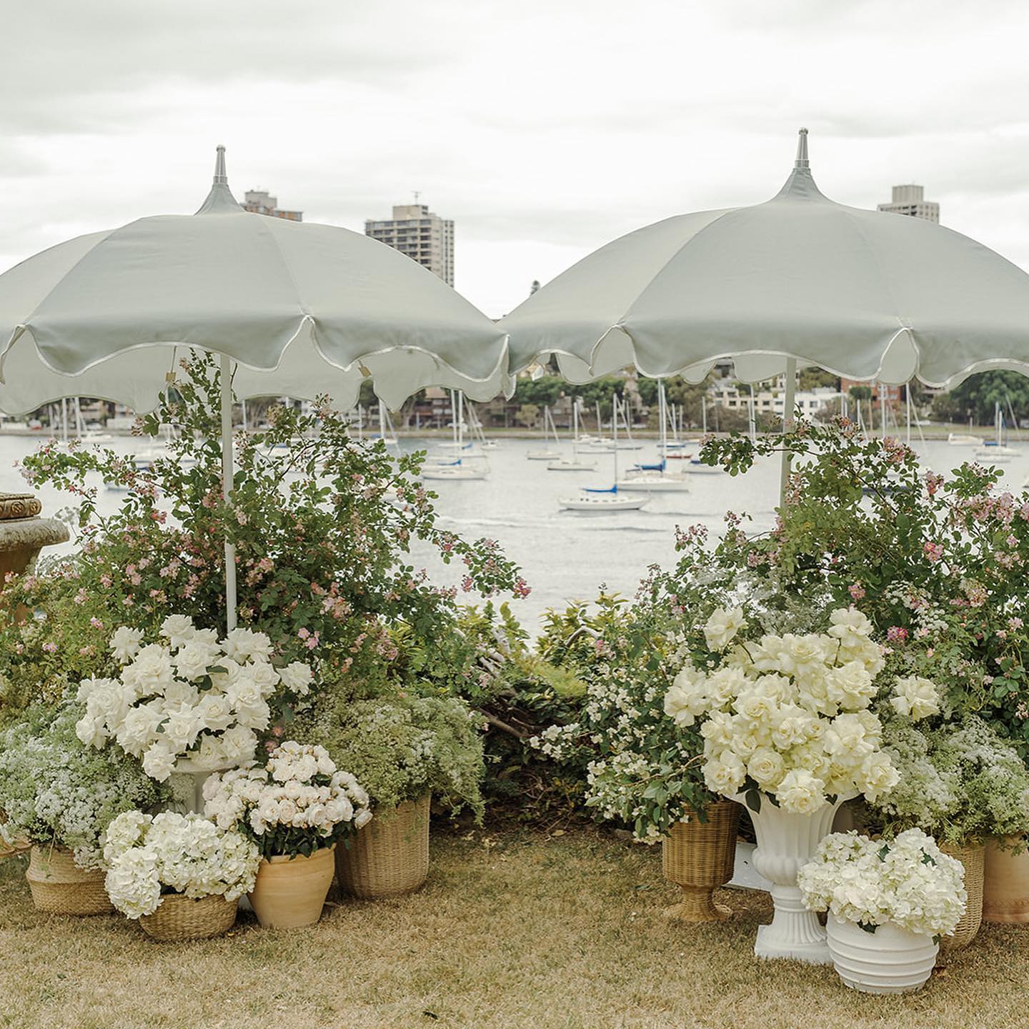
Ocean Blue
Ocean Blue is a calming and soothing shade of blue that is ideal for a beach or coastal-themed wedding. This color is great for a summer or fall wedding and is sure to create a relaxed and tranquil atmosphere. You can incorporate this color into your wedding through bouquets, centerpieces, and even the bridesmaids’ dresses.
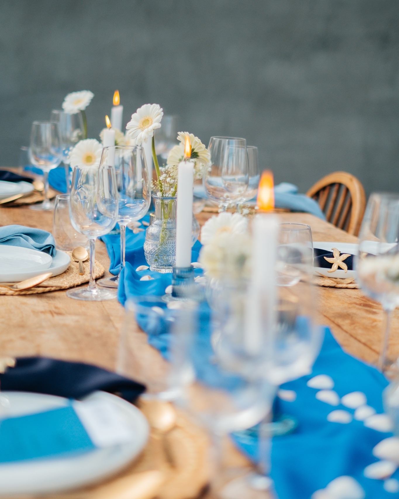
Consider pairing Ocean Blue with sandy shades like beige and khaki for a beach wedding, or with nautical shades like navy and red for a coastal-themed wedding.
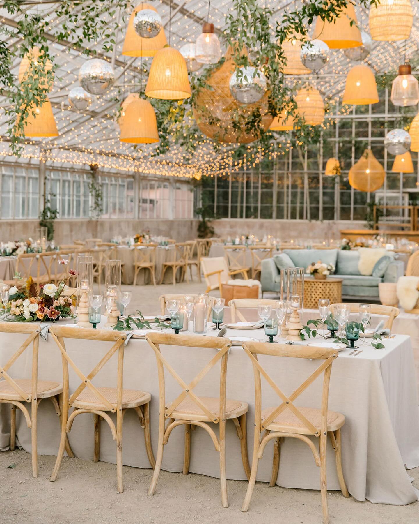
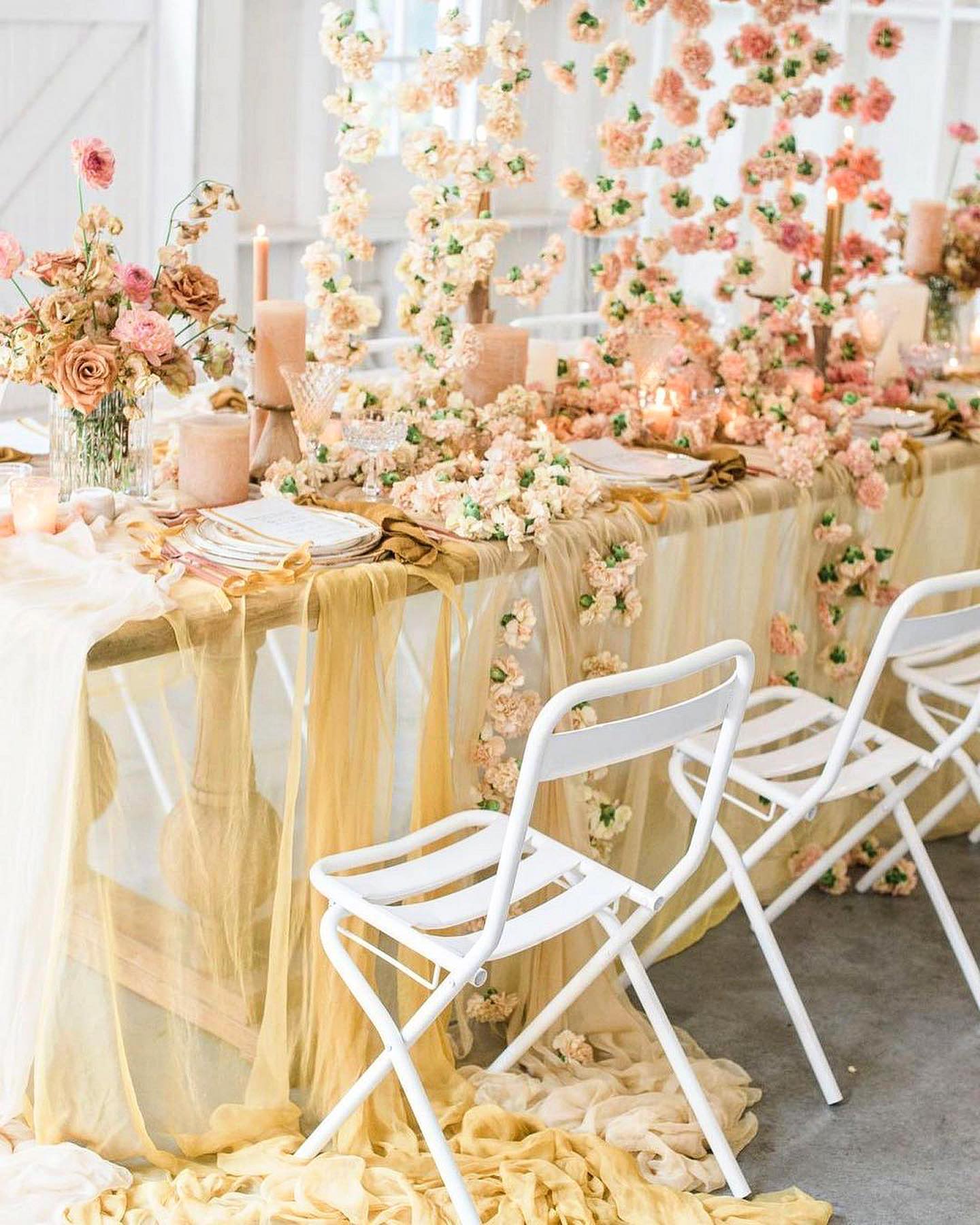
Golden Hour
Golden Hour is a warm and sunny shade of yellow that is perfect for a romantic and intimate wedding celebration. This color is great for a summer or fall wedding and is sure to bring a touch of warmth and coziness to your big day. You can incorporate this color into your wedding through bouquets, centerpieces, and even the bridesmaids’ dresses.
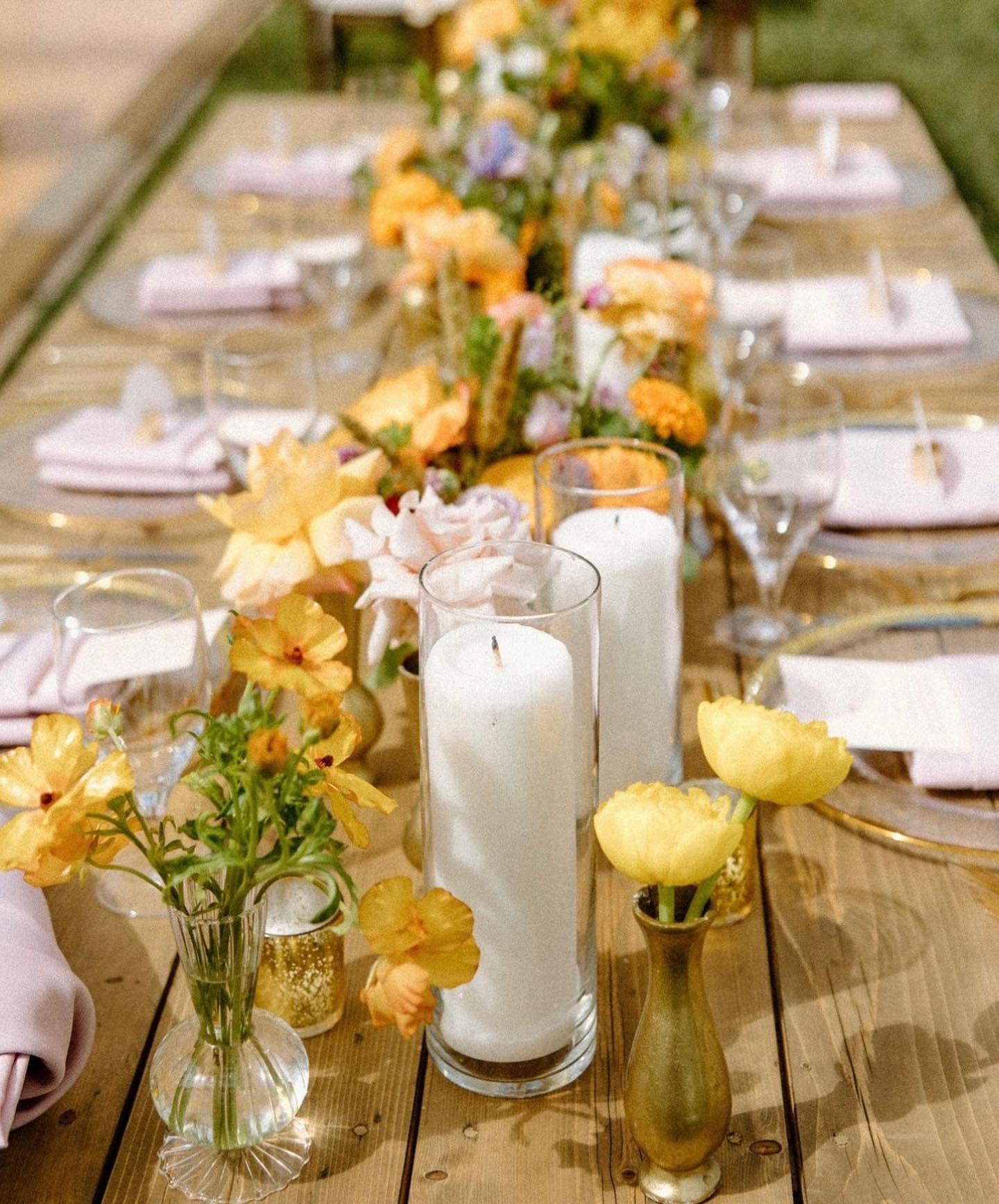
Consider pairing Golden Hour with earthy shades like olive and terracotta for a rustic-inspired wedding, or with gold or silver accents for a more formal wedding.
As we look ahead to 2024 wedding color trends, engaged couples have an abundant palette to choose from to make their wedding vision a reality. From earthy neutrals to bold brights, metallic glam, and romantic pastels, brides and grooms can curate a color scheme that showcases their style. By considering what’s forecasted to be popular, couples can pull together a distinctive, on-trend palette that sets the tone to tell their love story with chic inspiration. With some planning around 2024’s top wedding color ideas, brides and grooms can create a wedding that wows.