Winter is a season that brings to mind cool colors like blues, grays, and whites, reflecting the icy scenery and cloudy skies. These hues can affect our feelings and overall mood, so it’s essential to grasp their psychological effects and how they can be paired with warmer shades for a sense of balance. In this article, we’ll delve into the psychology of cool tones and their influence on seasonal color trends, while also showcasing stunning winter color palettes to spark your creativity in design.
The Psychology of Cool Tones
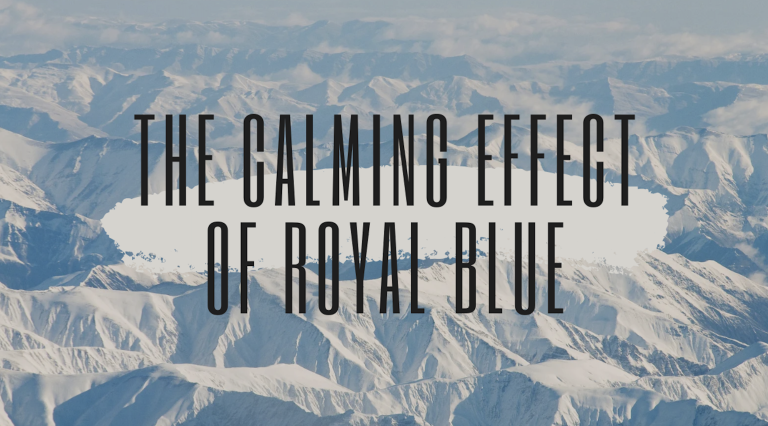
Cool tones like blue, gray, and white are often associated with calmness, tranquility, and introspection. While these colors can create a sense of serenity, they might also lead to feelings of melancholy if overused, especially in winter when natural light is scarce.
Blues and Grays: Blue is known for its calming effect, helping to reduce stress and encourage relaxation. However, darker shades of blue can sometimes come across as somber or cold. Gray, being a neutral color, can provide a grounding effect, but it may also contribute to a subdued or dreary atmosphere if not complemented with brighter hues.
To balance the cool tones, incorporating warmer accents like gold, rust, or peach can help mitigate their isolating effects, resulting in spaces or designs that feel more inviting and harmonious.
Seasonal Color Trends: How Cool Tones Are Used in Winter Design
In fashion, interior design, and branding, winter seasonal color trends typically favor cool tones that mirror the natural surroundings. Soft blues, icy whites, and silvery grays take center stage, resulting in a fresh and clean look. Lately, these cool shades are being combined with muted warm tones to add contrast and depth, giving designs a cozier and more harmonious feel.
Winter Blues and Cool Tones: 10 Inspiring Palettes
1. Arctic Chill
Arctic Chill captures the icy beauty of winter mornings with shades of blue, grey, and white. It evokes feelings of calm and introspection, making it ideal for serene designs.
Ice Blue (#A9D6E5): A crisp, light blue that reflects frosted landscapes.
Steel Gray (#BCC2C7): Grounding and neutral, reminiscent of overcast skies.
Snow White (#F2F3F4): A pure, clean white that symbolizes freshness and clarity.
2. Frosted Twilight
This palette brings together cooler tones with hints of muted warmth, reflecting winter evenings.
Pale Lilac (#D8C4E1): A soft, romantic purple for tranquility.
Cloud Gray (#D3D6DB): Neutral and grounding, like a gentle fog.
Blush Pink (#F7CED7): A subtle, warm pink that adds softness and charm.
3. Polar Glow
Polar Glow blends cool blues and warm golds, representing the interplay of cold and light during the winter.
Glacier Blue (#A1CAD6): A deep, reflective blue.
Slate Gray (#7D8D99): A neutral tone that adds depth.
Golden Ember (#FFD27D): A warm gold that brings an inviting contrast.
4. Midnight Frost
Perfect for dramatic and elegant designs, Midnight Frost features rich hues and subtle contrasts.
Navy Blue (#2B3A67): A deep, regal blue.
Charcoal Gray (#444B52): Sleek and modern, adding sophistication.
Soft Lavender (#D7C9E7): A gentle tone to soften the darker shades.
5. Snowbound Serenity
A tranquil palette inspired by snow-covered landscapes and quiet stillness.
Winter White (#EFF6FA): A clean, crisp white.
Pale Mint (#D5F4E6): A soft green for balance.
Pebble Gray (#BFC4C8): Neutral and calming, like snowy rocks.
6. Icy Dreams
This palette mixes dreamy blues and greens, offering a fresh and vibrant look.
Aqua Blue (#B2E0D8): Bright and refreshing.
Cool Teal (#88C3C9): A deeper, calming green-blue.
Ash White (#E7ECEF): A neutral shade for balance.
7. Frozen Forest
Frozen Forest brings together natural greens with icy accents for a refreshing, organic feel.
Forest Green (#2F6D42): Rich and natural.
Frost Blue (#A7DDEE): Light and frosty.
Silver Mist (#CACCCB): A neutral grey to round out the palette.
8. Polar Sunset
Inspired by the beauty of sunsets over frozen landscapes, this palette feels warm and dramatic.
Golden Orange (#E8A87C): Warm and glowing.
Cool Blue (#84C9D9): Fresh and clean.
Slate Gray (#6C7885): Neutral for grounding.
Soft Peach (#F8D6B1): A warm, soft peach for a gentle start to the day.
Dusty Blue (#B2C9D8): A muted, calm blue that mimics the early morning fog.
Frosted Lavender (#D6B6D5): A light, cool lavender that adds tranquility and elegance.
A luxurious winter palette that pairs cool tones with sophisticated metallic accents.
Silver Mist (#B9B9B9): A light, reflective silver that evokes elegance.
Midnight Blue (#003D5B): A deep, dark blue that adds depth and drama.
Champagne Gold (#F2D8A7): A rich, warm gold that brings a touch of opulence.
How to Use Cool Tones Effectively
Uncover the Psychology of Winter Colors
Cool tones in winter can significantly affect our mood, encouraging calmness and deeper reflection. By grasping the psychology behind these cool tones and embracing seasonal color trends, you can craft designs that not only mirror the season but also connect on an emotional level.
Combining blues and grays with warmer accents allows you to strike a harmonious balance that helps alleviate the “winter blues” while celebrating the season’s unique charm. Let the winter color palettes above inspire your next project and capture the true essence of winter in your designs!