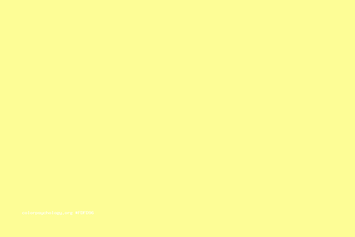
Pastel yellow is a soft, muted shade of yellow that radiates a sense of warmth, cheerfulness, and delicacy. Its hex code is #FDFD96, a gentle combination of red, green, and blue values that yield a light, buttery hue.
|
Triad
A triad color scheme consists of three colors evenly spaced on the color wheel.
|
|
|---|---|
|
Tetrad
A tetrad color scheme uses four colors arranged into two complementary pairs.
|
|
|
Monochromatic
A monochromatic color scheme uses variations in lightness and saturation of a single color.
|
|
|
Analogous
An analogous color scheme uses colors that are adjacent to each other on the color wheel.
|
|
|
Split Complements
A split-complementary color scheme uses a base color and the two colors adjacent to its complement.
|
Pastel Yellow Tints & Shades
|
Tints
Tints are created by adding white to a base color, resulting in lighter variations of the original color.
|
|||||||||
|---|---|---|---|---|---|---|---|---|---|
|
#fdfda0
|
#fdfdab
|
#fdfdb5
|
#fdfdc0
|
#fefeca
|
#fefed5
|
#fefedf
|
#fefeea
|
#fefef4
|
#ffffff
|
|
Shades
Shades are created by adding black to a base color, resulting in darker variations of the original color.
|
|||||||||
|
#e3e387
|
#caca78
|
#b1b169
|
#97975a
|
#7e7e4b
|
#65653c
|
#4b4b2d
|
#32321d
|
#19190e
|
#000000
|
Create Color Palettes with Pastel Yellow
The Meaning and History of Pastel Yellow
Pastel yellow, along with other pastel colors, gained prominence in the 18th century during the Rococo period. This artistic movement embraced light, airy colors, and delicate, ornate designs, which perfectly suited the softness of pastel yellow. The color became a popular choice for fashion and interior design, particularly among the aristocracy.
In the 1950s, pastel yellow experienced a resurgence in popularity as part of the “pastel trend.” This era saw a shift towards softer, more subdued colors in fashion and home decor, with pastel yellow being a key player in creating a sense of warmth and nostalgia.
Today, pastel yellow continues to be associated with springtime, new beginnings, and a sense of freshness and vitality. Its gentle, approachable nature makes it a popular choice for a wide range of design applications.
Uses of Pastel Yellow in Marketing, Business, and Design
In the world of marketing and branding, pastel yellow is often used to convey a sense of friendliness, approachability, and optimism. Many brands targeting children or families incorporate pastel yellow into their visual identity to create a warm, inviting atmosphere.
For web design, pastel yellow can be employed as a subtle background color or accent hue to add a touch of warmth and cheer to a website. It pairs well with other pastel colors, as well as with crisp whites and soft grays, to create a fresh, modern look.
Interior designers often turn to pastel yellow when aiming to create a cozy, inviting space. Its soft, buttery tones work well in nurseries, kitchens, and living rooms, where it can help to foster a sense of comfort and happiness. Pastel yellow can be incorporated through wall colors, textiles, or decorative elements, and it complements a range of design styles, from shabby chic to contemporary.

The Psychology of Pastel Yellow
Psychologically, pastel yellow is associated with feelings of happiness, optimism, and creativity. Its soft, cheerful tones can help lift the mood and promote a sense of well-being, making it an excellent choice for spaces where a positive, uplifting atmosphere is desired.
In color psychology, yellow is often linked to mental clarity, focus, and innovation. Pastel yellow, with its gentler, more muted appearance, can evoke these qualities without being as overwhelming or stimulating as brighter, more saturated yellows.
However, it’s important to use pastel yellow in moderation, as an overabundance of the color can sometimes lead to feelings of anxiety or unease. Balancing pastel yellow with other colors, textures, and patterns can help to create a harmonious, visually appealing design.
When used thoughtfully, pastel yellow can be a powerful tool for creating spaces and designs that feel warm, inviting, and full of life. Its timeless charm and versatility make it a go-to choice for designers and brands seeking to evoke a sense of happiness and positivity.
In conclusion
Pastel yellow, with its soft, buttery appearance and cheerful undertones, is a color that embodies warmth, optimism, and delicacy. Whether used in branding, web design, interior spaces, or fashion, pastel yellow has the power to create an atmosphere of happiness, creativity, and comfort. By understanding its history, psychological associations, and design applications, one can effectively use the gentle allure of pastel yellow to craft uplifting and inviting visual experiences.