The Oklahoma City Thunder feature the colors blue, orange, yellow, and white as their official team colors. Blue represents loyalty and pride, as it connects the Thunder to the state colors of Oklahoma. Orange symbolizes the bright energy and excitement of the young franchise, while yellow echoes the warm sunshine of the Great Plains. White provides a crisp, clean contrast. The original Thunder logo from 2008-2015 was dominated by these colors, with a standalone blue basketball surrounded by orange and yellow accents.
When the logo was updated in 2015, more navy blue was incorporated along with a streamlined basketball/lightning image. Throughout their relatively brief history, the Thunder’s unique color scheme has developed an identity symbolizing the hardworking, wholesome values of the Oklahoma community. As an NBA franchise, the Thunder strategically use their colors and branding to generate regional enthusiasm and a shared sense of state pride.
| Color Name | Color | Hex | RGB | CMYK | Pantone |
|---|---|---|---|---|---|
| Thunder Blue | #007AC1 | 0 125 195 | 89 43 0 0 | 285 C | |
| Sunset | #EF3B24 | 239 59 36 | 0 92 100 0 | Warm Red C | |
| Navy Blue | #002D62 | 0 45 98 | 100 68 0 54 | 282 C | |
| Yellow | #FDBB30 | 253 187 48 | 0 29 91 0 | 1235 C |
Oklahoma City Thunder Logo
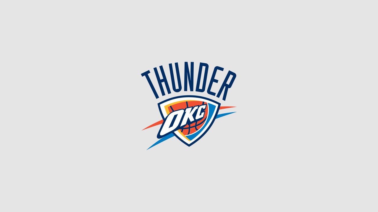
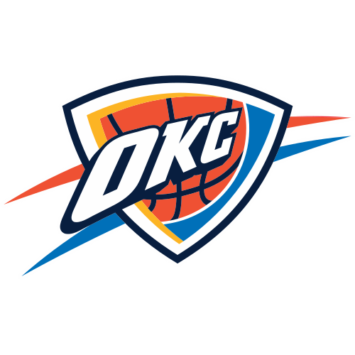
The logo of the Oklahoma City Thunder presents a striking combination of colors and elements that encapsulate the team’s identity. The shield-shaped logo is primarily in a vibrant shade of blue, symbolizing loyalty and unity, which are key aspects of the team’s ethos. Enclosed within the shield, the letters “OKC” are prominently displayed in white with orange outlining, standing for Oklahoma City and providing a crisp contrast against the blue.
The basketball depicted in the center of the logo is rendered in rich, warm tones of orange, which is often associated with energy and enthusiasm, mirroring the vibrancy of the team’s spirit. The orange is complemented by the blue, creating a visual representation of the excitement of the game. Additionally, the two light blue streaks flanking the shield give a sense of motion and speed, perhaps signifying the team’s agility and dynamism on the court.
The color scheme of the logo—blue, orange, and yellow—reflects the Thunder’s official colors, each chosen for its psychological impact and its representation of Oklahoma’s cultural heritage and the energy of the team and its fans. The overall design of the logo is modern and bold, capturing the essence of a team that prides itself on its competitiveness and its connection with the community and fans.
 |
 |
